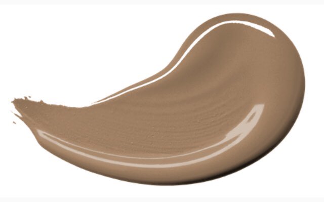
Spiced Honey has been unveiled by AkzoNobel as their Color of the Year for 2019. The shade was selected following expert research into global trends, insights and consumer behavior.
According to the color experts, 2018 has been tumultuous. People have felt overwhelmed by the deluge of news and demands upon their time. For the coming year, these analysts believe people are ” looking for their world to feel energizing and warm, natural and true. This led to the selection of classic, comforting tones of Spiced Honey

This is not one of my favorite shades. I’m actually surprised the color marketers didn’t play up the warmth of classic tweeds as part of their inspiration. With homeowners still renovating homes that were decorated in a heavy Tuscan Style, I’m not sure they’ll be ready to use this classic brown.
This picture, created by the paint company’s visualizer app, uses Spiced Honey as an accent stripe on a pale peach wall. The Charcoal blue – which is closer to the direction I thought they’d go for next year – used on the cabinets helps to ground the room.
“Spiced Honey is balanced by the warmth and earthiness of mid-brown and burgundy: soft but serious colors that can feel quietly supportive. It is a tone that our trend analysis identified as a contemporary yet timeless classic, and one that is currently being seen in new architecture and interior design all around the world.”
How to Use Spiced Honey
To support our color of the year, AkzoNobel created four interior palettes that help to emphasise the energy and warmth of Spiced Honey.
THINK palette – spaces for calm

The Think color scheme creates spaces that encourage careful consideration for those within them. The warm neutrals and honey tones are positive but calm, soft but serious. This is a palette for any space where people may need to relax, focus and take the time to contemplate.
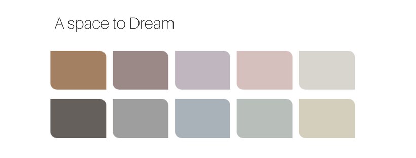
DREAM palette – spaces for succeeding

This palette helps to create spaces that are more soothing. It works anywhere that you need to encourage imagination and relaxation due to the restful properties of pale blues and violet. Consider it for healthcare and anywhere you want to encourage relaxation and wellness.
LOVE palette – spaces for sharing
Use the Love palette to create spaces that subliminally bring people together. The deep reds are stimulating and lively, and overall the rich hues give a sense of warmth without feeling heavy or overbearing. Consider it for anywhere that people live or come together to socialize.
ACT palette – spaces for action

The Act palette can help to create spaces that encourage dynamism. The colors pop and are loaded with energy to encourage movement around the built environment. The Act collection of colors is ideal for spaces that need to
energize their occupants and encourage them to have a positive, creative attitude.
What do you think of this color choice? How do you like it compared 2018‘s choice? Is it timeless and calming? Neutral yet energetic? Leave me your comments below.


