
Leading color experts from AkzoNobel have selected a shade of blue called Denim Drift as the Color of the Year for 2017.
 After 18 months of research and debate, the team at AkzoNobel (which owns the paint company Dulux), made the announcement during the launch of the company’s annual trends forecast known as “ColourFutures.” Denim Drift is the foundation for an inspirational palette of paint colors centered on the expected global social and design trends for the upcoming year.

“The Color of the Year and its complementary color palette tell the story of our Life in a New Light trend, with darker and lighter hues that change the mood of a room.” —Heleen van Gent, Head of AkzoNobel’s Global Aesthetics Center
Denim Drift has had great reception among the design community and why wouldn’t it? It’s a less sugary version of Pantone’s 2016 COTY Serenity. Additionally, Blue is known to be the world’s favorite color, cutting across geographic and cultural boundaries.

At first I had no idea what shade of blue Denim Drift was because I kept seeing various blues in pictures inspired by the complimentary palette.
Denim Drift is a timeless color that turns more vibrant or gray-ish, depending how you combine it, and in what light you see it.
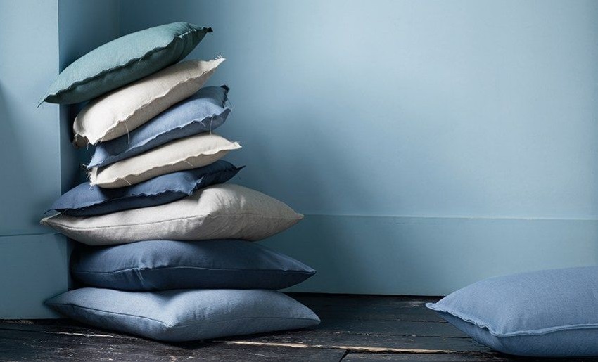
 Here, Borrowed Blue, Earl Blue, Denim Drift and Indigo Shade are used to create this tranquil space. The ombre wall is on point with the natural finish dinette that follows the Raw Materials Trend.
(DIY: How to Paint an Ombre Wall via Behr)

With a heavier focus on visual texture, metallic accents and pared back styling with the inclusion of an industrial floor, this inspiration image follows one of the 4 Global Trends Dulux has forecasted for 2017.

Metallics such as gold, brass or copper work very nicely with Denim Drift. I think 2017 will see a shift away from the popular Bohemian palettes of the last few years back towards a classicism that does not include rose gold.

This Denim stain is a perfect complement to the Moon Grey stone tops and splash. When designing your dream kitchen luxury materials and high end design deliver splendor without unnecessary accessories and embellishments..

Denim Drift has cross-generational appeal making it desirable to both the young and old.

The relaxed mood that faded denim generates instantly, makes Denim Drift particularly suitable for environments such as the bedroom or bathroom.
This sheer drape in Denim Drift creates soft, ethereal light in this very white bedroom.

Denim Drift is also meditative in nature which makes it ideal for concentration or introspection.

This glass tile blend looks elegant combined with rich brown cabinetry and oil-rubbed bronze fixtures.

While gentlemen’s clothes hang in this gorgeous walk-in closet from Mike Hammersmith, it could easily be share by a woman.
 I love how Denim Drift works as a neutral for this store display.
I’ll post more photos on my Pinterest Color Tends Board. Check it out HERE and like the Color of the Year Choice for 2017 you prefer the mos.