It seems like I just wrapped up the new color choices for 2017 and already it’s time to look at what PANTONE predicts will be the trending colors for Interiors in 2018.
Last year Greenery burst forth to be this year’s Color of the Year choice. According to interest on Pinterest, viewers prefer Pantone’s Fathomless palette which combines Greenery with a palette of greens and blues that evoke memories of a summer day by the water.
Often there’s a unifying color in the new palettes that Pantone releases that will be the new pick for 2018 Color of the Year. Which do you think it will be?
PANTONE VIEW Home + Interiors 2018 Color Trends
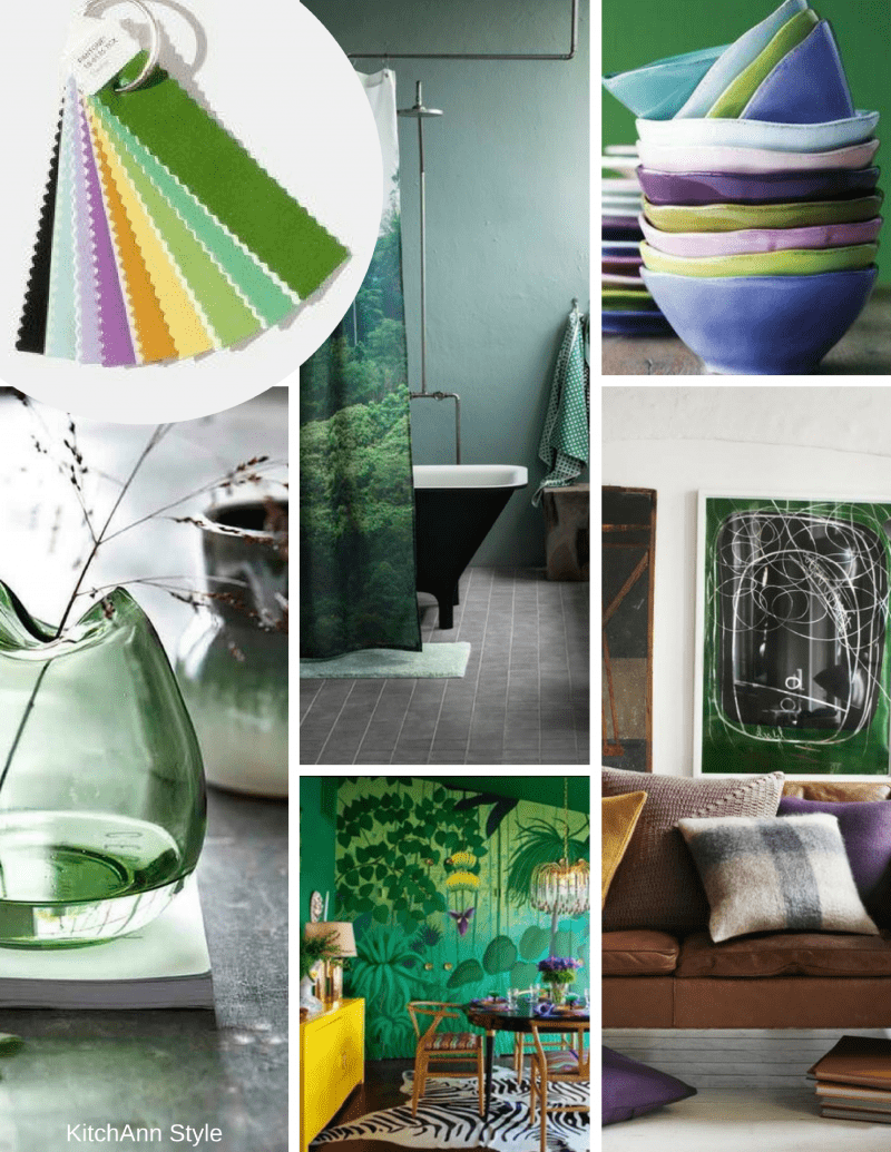
Verdure: This palette features vegetal kinds of colors like Celery and Foliage being combined with berry-infused purples and an eggshell blue. “This palette is so symbolic of health,” said Eiseman, but it updates the profusion of greens with some bright and contrasting hues.
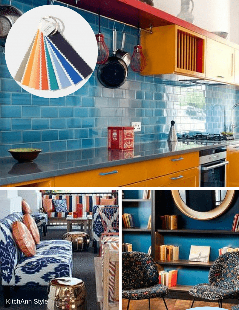
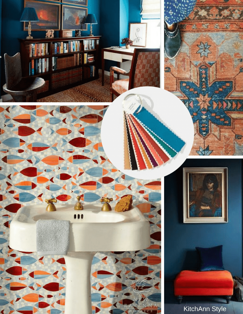
Resourceful: Complementary colors on the color wheel – oranges and blues – are combined in this palette that is clever and “resourceful” in re-using and re-furbishing what consumers may already own. “This is quite an interesting color combination,” said Eiseman. “It combines warm and cool tones that you just can’t avoid looking at it.”
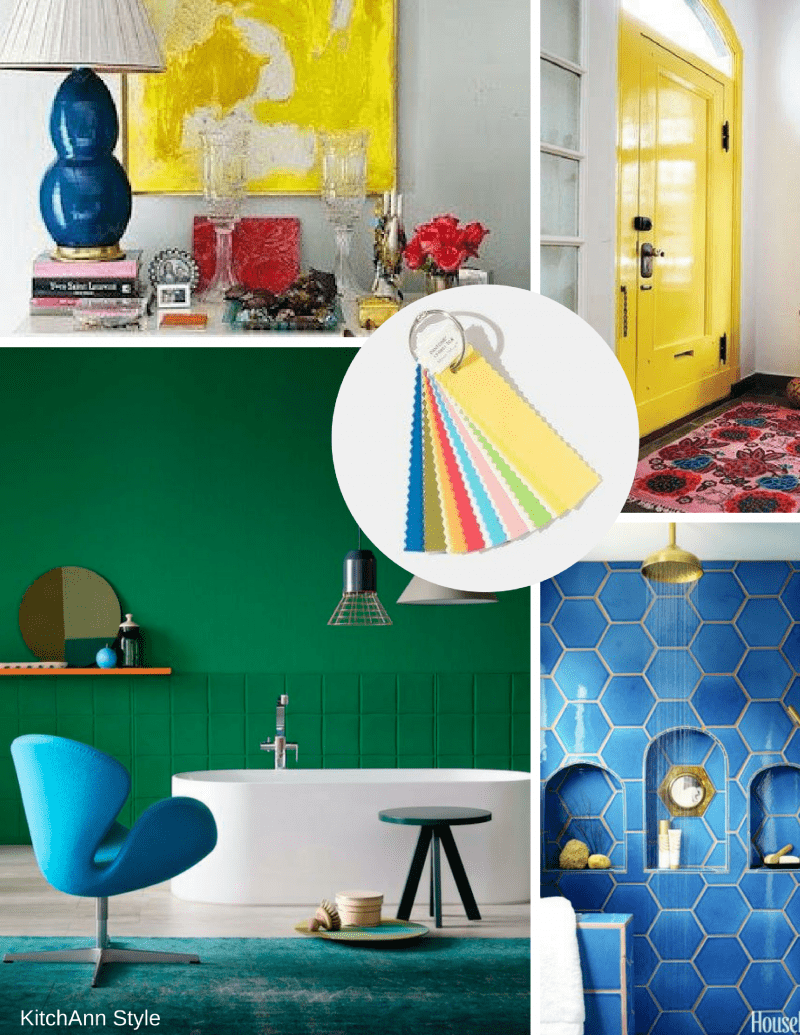
Playful: Think “Minions.” Bright yellow, lime popsicle, and all other things fun come together for this color scheme. “People need to stop and smile,” said Eiseman.
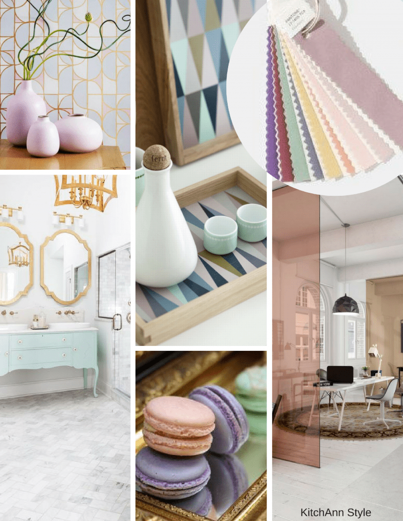
Discretion: Playful’s alter ego. Subtle hues such as Elderberry and Hawthorne Rose offer a new sense of strength. “Pink has developed more power than ever before,” said Eiseman.
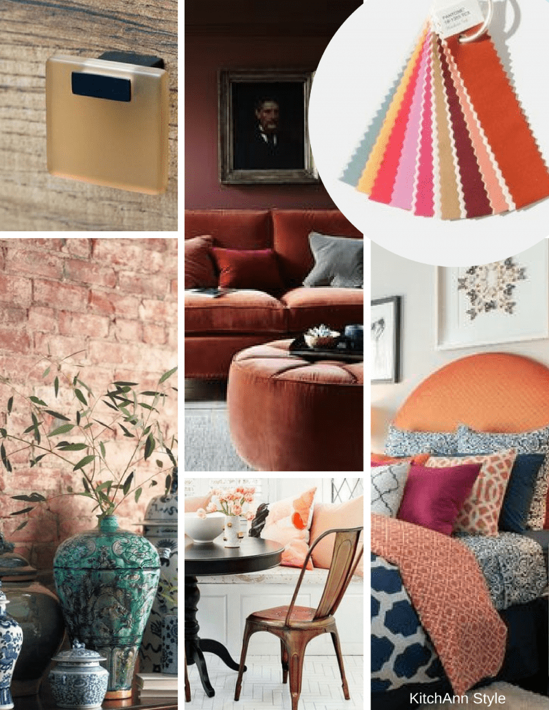
Far-fetched: With warm, earthy hues such as Cornsilk Yellow blending with rosy tones, this palette “reaches out and embraces many different cultures,” said Eiseman.
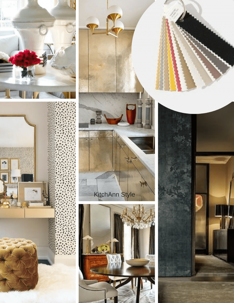
Intricacy: A palette of neutral metallics (aka, the “new neutrals”) with accents of dramatic Holly Berry Red and yellow Sulfur.
Intensity: This is an eclectic mix of colors that evokes a sense of strength, power and sophistication, all balanced with black and gold.
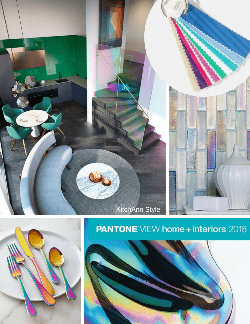
TECH-nique: Bright turquoise, pink and purple colors anchored with Brilliant White and Frosted Almond nod to technology. This palette is all about hues “that seem to shine from within,” said Eiseman.
It’s always difficult for me to pick a favorite theme but sometimes I like one mood board more than others.
Which is your favorite?
While I like Discretion a lot but I think Verdue will be very popular.


