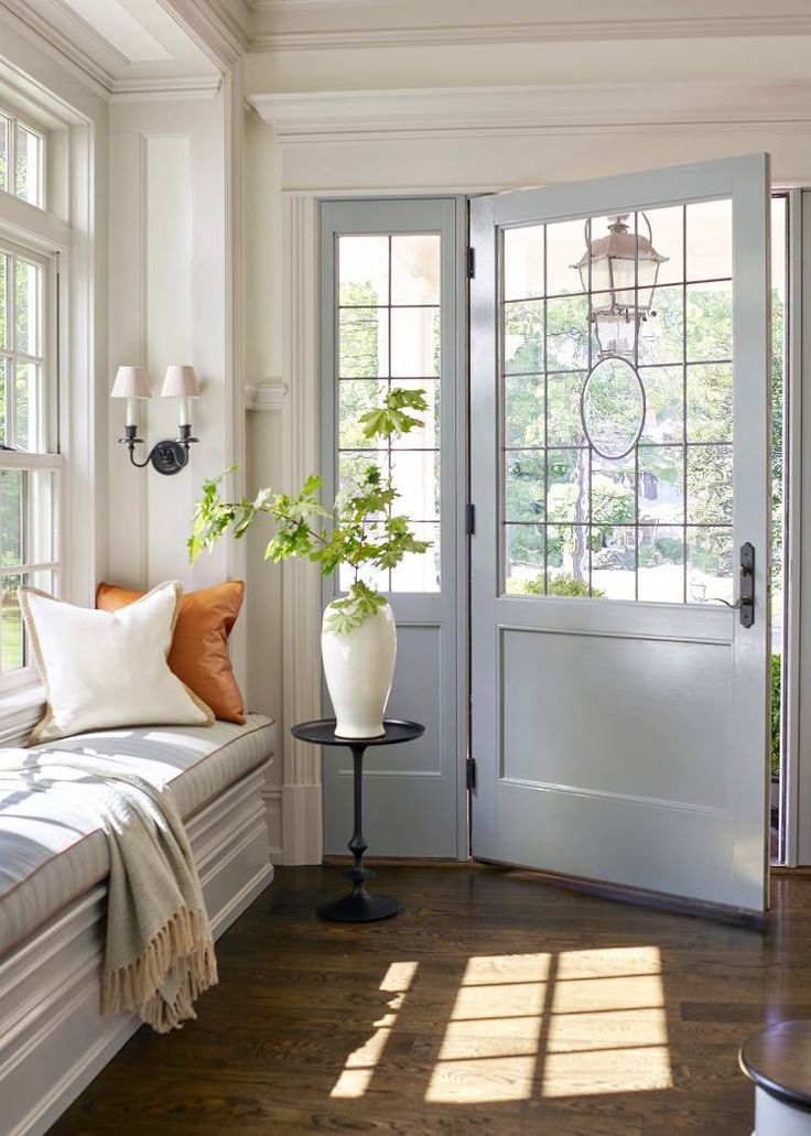
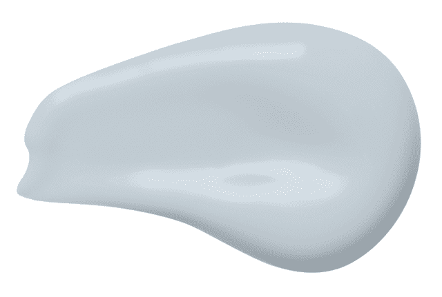
Sherwin-Williams, which just revealed that their 2024 Color of the Year is Upward. It’s a very pale, dreamy blue with soothing gray undertones; it’s crisp, clean, and timeless.
To explain why Sherwin-Williams opted for this cool hue, Sue Wadden, the brand’s director of color marketing, says it “represents the gentle forward momentum in all of our lives. It brings to life that carefree, sunny day energy that elicits a notion of contentment and peace.”

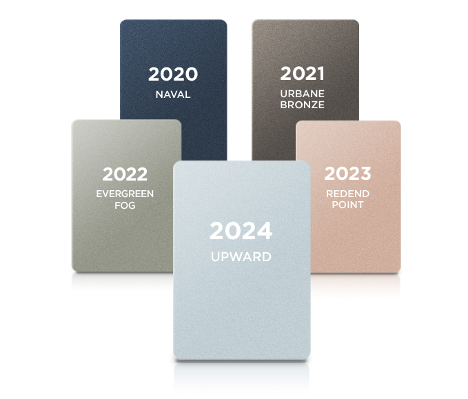
Plus, with all of the warm shades popping up right now in design, especially as we enter cozy season, Upward is a refreshingly different choice. Sherwin-Williams acknowledges it’s a departure from last year’s earthy, clay-like color, Redend Point, stating that it’s “an invitation to open minds to a color of ethereal calm that is ever-present—if we remember to keep looking up.”

Pair this slightly frosty shade with cream or pastel soft goods, along with lighter wood tones like oak, for an open, airy Coastal vibe.

Sherwin-Williams recommends pairing the hue with blues and greens, deeps and darks and delicate tints from classic coastal to casual Nordic styles.

The color experts at Sherwin-Williams introduce new COTYs that work cohesively with past year’s selections thus ensuring the staying power of these color applications. I’m still a fan of 2021 Urban Bronze. Look back at previous posts inspired by Sherwin-Willimas Coty.


