2017 North American Key Color

CMG North American Key Color 2017 | KitchAnn Style

The Color Marketing Group (CMG) has named Thrive as their Key Color for North America 2017+.

Just as PANTONE picked Greenery ( 15-0343) as their Home + Interiors Color of the Year (COTY) and Kale (18-0107) as a top Spring 2017 Fashion pick, CMG follows suit with a vegetal inspired color.

The CMG posits this yellow-influenced green will establish itself as a colorful symbol for growth, strength and endurance.

CMG North American Key Color 2017 | KitchAnn Style

Thrive  is purposely balanced between light and dark, pale and strong. Continue reading “2017 North American Key Color”

Are You Ready for Pantone 2016 Color Trends?

Pantone Color Trends 2016 | KitchAnn style

Pantone Color Institute has unveiled its annual trend forecast for interiors for the coming year. There are nine palettes  in the  PANTONE VIEW home + interiors 2016 – Innovation and Impact, a color forecast highlighting trends for the home and interiors marketplace

Natural Forms: Shades that are plumbed from natural sources such as warm rosy clay and sheepskin beige. Continue reading “Are You Ready for Pantone 2016 Color Trends?”

Pantone Color of the Year 2014

18-32224 Radian Orchid | KitchAnn Style
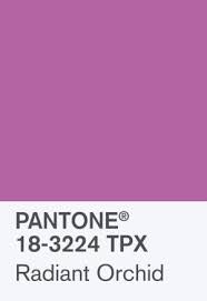
I’ve been avoiding writing about the Pantone Color of the Year for 2014: Radiant Orchid 18-3224 because most people don’t like it.

So I’ve been asking myself how did Pantone miss the boat on this color? The 2013 COTY, Emerald, was a smash hit. People were racing to create whole Pinterest Pages around the color. It’s January and I can’t find a single person excited about the color. Radiant Orchid must have some great applications.

Pantone describes the color as “an enchanting harmony of fuchsia, purple and pink undertones, Radiant Orchid inspires confidence and emanates great joy, love and health. It is a captivating purple, one that draws you in with its beguiling charm.”

Fashion:

I guess you can pull this color off if you are a rock star…

Prince | KitchAnn Style

…or the daughter of one.

Kelly Osbourne | KitchAnn Style

I just don’t think this color will survive past the 2014 spring lines so I wouldn’t make a large wardrobe investment in this color even if Pantone says it looks great against the skin for men and women. I might splurge for a mani like this one though.

Pantone Radiant Orchid Nails

Wedding:

The Wedding industry seems to love this color and why wouldn’t they – Orchids are great bridal flowers.

Orchid bouquets | KitchAnn Style

The color is seductive when paired with red and pairs well with its sister shades of lavender, purple and pink giving wedding planners and stylists opportunities to create romantic makeup, colorful accessories, and vibrant tablescapes.

Radiant Orchid macarons | KitchAnn Style

Radiant Orchid wedding ideas | KitchAnn Style

Home:

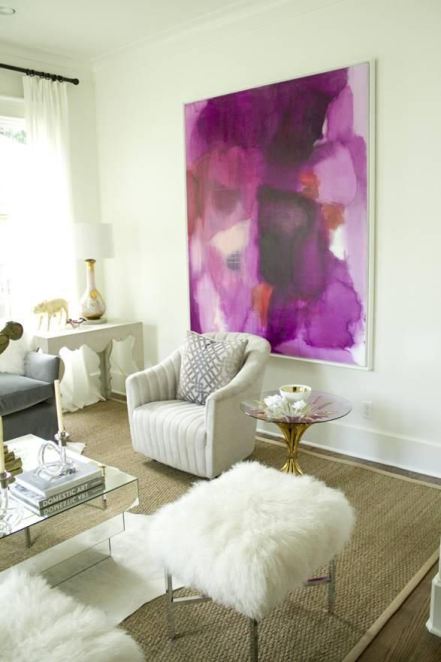
It’s never good to be too trendy with your decorating choices. If you choose to decorate with Radiant Orchid it’s best as an accent or used in a lighter shade with lots of neutrals for larger scale items.

Radiant Orchid Wall art | KitchAnn Style

This is my favorite photo for Radiant Orchid in the home. I like how the art pops against the neutral room.

Radiant Orchid Wall | KitchAnn Style

Orchid sofa | KitchAnn Style

Radiant Orchid Accent | KitchAnn Style

How would you use Radiant Orchid in your home?

2009 Color of the Year: Mimosa

Pantone 2009 Color of the Year: MimosaPantone has officially named color 14-0848, Mimosa, as it’s 2009 color of the year.

During this time of economic uncertainty and political uncertainty, no other color expresses hope and optimism more than yellow.

“The color yellow exemplifies the warmth and nurturing quality of the sun, properties we as humans are naturally drawn to for reassurance,” explains Leatrice Eiseman, executive director of the Pantone Color Institute®. “Mimosa also speaks to enlightenment, as it is a hue that sparks imagination and innovation.”

Pantone 2009 Color of the Year: Mimosa

Pantone said the flowers of the mimosa tree, as well as “the sparkle of the brilliantly hued cocktail” are key to this color that “coordinates with any other color, has appeal for men and women, and translates to both fashion and interiors.”


Pantone 2009 Color of the Year: Mimosa
sonja la fluer mosaic

Pantone 2009 Color of the Year: Mimosa

Goodbye Blue!  Hello Mimosa!