
Faith makes all things possible.
Hope makes all things work.
Love makes all things beautiful.
May you have all three this Christmas.
-Ann

Design | Wellness | Cabinetry

 I was going to combine the Sherwin-Williams Color of the Year post with the previous post about AkzoNobel’s Color of the Year 2015 choice but I found so many great inspiration photos I decided I had to break it out.
Sherwin-Williams chose Coral Reef (SW 6606) as their Color of the Year 2015. It’s part of the Buoyant color palette I wrote about previously.
“Its unexpected versatility brings life to a range of design aesthetics, whether traditional, vintage, cottage or contemporary.” -Jackie Jordan, Sherwin-Williams director of color marketing.

Coral Reef is warmer than AkzoNobel’s Copper Orange and is a wonderful compliment to the Blues that have been popular these past few seasons.

Coral reef plays happily with white, black, lush greens and lilacs. For a more subdued palette, mix it with warm neutrals such as gray and soft browns.

Coral Reef is not the pumpkin color from the 50’s. It’s a softer, more approachable color.

Since Coral Reef is such a flattering color, it’s well suited for use in bathrooms. Who doesn’t want to have a youthful glow?

Pair Coral Reef with matte gold or brass for a luxurious vintage feel.

Don’t limit the color to the interior. Consider brightening your home’s exterior by applying it to your front door, shutters, flower boxes or garden structures.
 As I wrap up my coverage of trending colors for 2015, things are heating up as a warmer spectrum of pinks, reds and oranges emerging, reflecting optimism and a renewed emphasis on sharing.
AkzoNobel, the largest color and coatings manufacturer in the world and maker of Dulux Paints, named Copper Orange as their Color of the year for 2015.
By closely monitoring the emerging social, economic and design trends around the world, a select panel of professionals predicts future color trends two years out.
“The overriding idea for 2015 is that people are finding new ways to add color to their lives and are developing a warmer and more caring environment for all.” – Heleen van Gent, Creative Director of AkzoNobel’s Global Aesthetic Center.

Warm and surprising, Copper Orange reflects a more positive outlook on the world while representing a new emphasis on putting the + (plus) in everyday. This flattering hue will surely be popular in the cosmetics industry just like the Pantone Color of the Year 2015, Marsala.

Copper Orange works well paired with neutrals. If you tend to shy away from color, go for small accessories and simple accents like this drapery edge treatment.

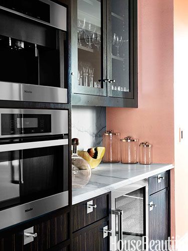
The Copper Orange walls are a nice balance with the dark cabinetry and make this kitchen cheery.

“It’s a “hot” color that evokes tropical fruit and flowers, Eastern culture as seen in Buddhist monks’ robes and, in the West, autumn’s warm glow.”

Express your Nomadic, adventurous side with relaxed decor and a textural application of Copper Orange.

Copper Orange can also be quite sophisticated. The small Copper Orange print is gorgeous in this gray bedroom.

I predict the popularity of Copper Orange will increase the use of Rose Gold, already popular in the fashion industry, within the home.
Copper Orange has been selected to complement all of the major trends that AkzoNobel has identified for 2015 – all inspired by one larger idea, “Everyday + Finding the wonderful in the normal”. For more on their trend forecast, visit www.colourfutures.com
Laurence van Seventer, a Dutch designer and founder of Lolo Palazzo is a creative frontrunner in industrial design who is innovative in welding metal with recycled bicycles, car parts and other discarded metal.

From her Hague Studio, Laurence van Seventer creates chandeliers that remind me a bit of the Atlantis chandelier from Barlas Baylar Lighting. Her larger chandeliers can incorporate as many as 600 upcycled bicycle chains and weigh 275 pounds.
Her designs begin organically and she does not know when she begins a piece what outcome it will have. In Laurence’s view, we live in a world that has to involve recycling. As an artist she likes the contrast between soft and industrial materials. Playing with the lighting levels also creates an added element of light play and drama to her lighting sculptures.

The Ballroom Blitz chandelier was recently featured at Design London’s Superbrands Design Festival this past fall. Many of Laurence’s chandelier designs can be found hanging in prestigious hotels around the world.
Laurence is currently working on a new collection called ‘Killing me Softly’, which is a combination of recycled steel and recycled; in collaboration with Label Mademoiselle Cecile.

In the lamp collection Laurence is showcasing more of her welding and plasma cutting skills. The lamp bases are constructed from motor bike parts.

In addition to lighting, Lolo Palazzo also produces mirrors, and sculptural pieces that range from flower bouquets to animal sculptures.

I’ve heard that Tent London and Super Brands were even bigger and better shows this year. I always tend to gravitate toward the lighting exhibitors. It would have been nice to see the Lolo Palazzo pieces in person.
To see more amazing pieces, visit the Lolo Palazzo Pinterest Page.
http://www.pinterest.com/lglvs/ballroom-blitz/