 As I wrap up my coverage of trending colors for 2015, things are heating up as a warmer spectrum of pinks, reds and oranges emerging, reflecting optimism and a renewed emphasis on sharing.
AkzoNobel, the largest color and coatings manufacturer in the world and maker of Dulux Paints, named Copper Orange as their Color of the year for 2015.
By closely monitoring the emerging social, economic and design trends around the world, a select panel of professionals predicts future color trends two years out.
“The overriding idea for 2015 is that people are finding new ways to add color to their lives and are developing a warmer and more caring environment for all.” – Heleen van Gent, Creative Director of AkzoNobel’s Global Aesthetic Center.
Warm and surprising, Copper Orange reflects a more positive outlook on the world while representing a new emphasis on putting the + (plus) in everyday. This flattering hue will surely be popular in the cosmetics industry just like the Pantone Color of the Year 2015, Marsala.
Copper Orange works well paired with neutrals. If you tend to shy away from color, go for small accessories and simple accents like this drapery edge treatment.
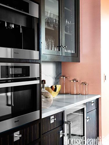
The Copper Orange walls are a nice balance with the dark cabinetry and make this kitchen cheery.
“It’s a “hot” color that evokes tropical fruit and flowers, Eastern culture as seen in Buddhist monks’ robes and, in the West, autumn’s warm glow.”
Express your Nomadic, adventurous side with relaxed decor and a textural application of Copper Orange.
Copper Orange can also be quite sophisticated. The small Copper Orange print is gorgeous in this gray bedroom.
I predict the popularity of Copper Orange will increase the use of Rose Gold, already popular in the fashion industry, within the home.
Copper Orange has been selected to complement all of the major trends that AkzoNobel has identified for 2015 – all inspired by one larger idea, “Everyday + Finding the wonderful in the normal”. For more on their trend forecast, visit www.colourfutures.com


