There were a few stand-outs in design trends this year. Here’s the rundown. Continue reading “Tile Trends 2015“
AkzoNobel Color of the Year 2015


AkzoNobel, the largest color and coatings manufacturer in the world and maker of Dulux Paints, named Copper Orange as their Color of the year for 2015.
By closely monitoring the emerging social, economic and design trends around the world, a select panel of professionals predicts future color trends two years out.
“The overriding idea for 2015 is that people are finding new ways to add color to their lives and are developing a warmer and more caring environment for all.” – Heleen van Gent, Creative Director of AkzoNobel’s Global Aesthetic Center.
Warm and surprising, Copper Orange reflects a more positive outlook on the world while representing a new emphasis on putting the + (plus) in everyday. This flattering hue will surely be popular in the cosmetics industry just like the Pantone Color of the Year 2015, Marsala.
Copper Orange works well paired with neutrals. If you tend to shy away from color, go for small accessories and simple accents like this drapery edge treatment.
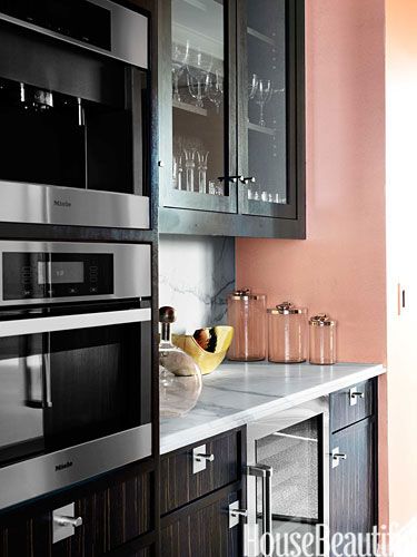
The Copper Orange walls are a nice balance with the dark cabinetry and make this kitchen cheery.
“It’s a “hot” color that evokes tropical fruit and flowers, Eastern culture as seen in Buddhist monks’ robes and, in the West, autumn’s warm glow.”
Express your Nomadic, adventurous side with relaxed decor and a textural application of Copper Orange.
Copper Orange can also be quite sophisticated. The small Copper Orange print is gorgeous in this gray bedroom.
I predict the popularity of Copper Orange will increase the use of Rose Gold, already popular in the fashion industry, within the home.
Copper Orange has been selected to complement all of the major trends that AkzoNobel has identified for 2015 – all inspired by one larger idea, “Everyday + Finding the wonderful in the normal”. For more on their trend forecast, visit www.colourfutures.com
http://www.pinterest.com/kitchann/color-trends/
Pantone Color of the Year 2015


“While Radiant Orchid, the captivating 2014 color of the year, encouraged creativity and innovation, Marsala enriches our mind, body and soul, exuding confidence and stability.” –Leatrice Eiseman, executive director of the Pantone Color Institute
Vintage-y, earthy and hinting at the dregs of a bottle of wine, the shade will pair well with the grays and blues from past seasons. The color works with other neutrals such as black and beige.
Eye-catching but not overwhelming, Marsala is a color that seems to pop up every twenty years or so. What makes this color different from the burgundy’s of the 70’s and 90’s is a departure from being a dominating color towards an updated sophistication that gives this deep blush a feeling of balanced harmony.
The stainless backsplash and white cabinets keep the bright Marsala wall from being too overwhelming in this example.
This is such a gorgeous art wall and is a great example of the harmony Marsala possesses.
According to Pantone, Marsala will be popular in home accessories such as rugs and botanical prints.
I almost chose an image that was they more typical varying shades of dusty pink with green foliage but then I thought; “where’s the inspiration in that?” I hope you like this image better.
Marsala is a favorite among Bohemian and Moorish Inspired interiors. Paired with Golds and Turquoise this color can be soothing and rich.
I had a difficult time finding pictures that were close in color to the Pantone Marsala. Many were too Pink or Purple or too dark and more Burgundy. It’s important to me for the images to be close because otherwise I’m writing about a different color and not the Color of the Year. I’m looking forward to the makeup collection Sephora should be coming out with soon. If you’re like me and everyone else I’ve talked to you are counting down the days until you can debut your gorgeous pout.
For more images, visit my Color Trends board on Pinterest.
http://www.pinterest.com/kitchann/color-trends/
Pittsburgh Paints Color of the Year 2015


Paisley Blue (PPG-1238-6) is a vibrant color with bold, inky undertones. It is enthusiastically positive and represents where design is headed in the coming year.
Homeowners will appreciate the reliability of this blue and incorporate it into their decor to positively influence their lives.
Blue Paisley looks terrific as an accent wall and can be balanced with neutral gray.
Combine a playful mix of hues and Blue Paisley feels more bohemian.
As the trend for warm alloys continues, expect to see other materials becoming richer and more luxurious in color and feel.
Blue Paisley is perfectly at home in a Coastal Interior. Small vessels are great way to add an accent color without making an expensive change in your home.
Blue Paisley is dramatic and will be noticed wherever you put it.
World travel will influence interiors in 2015 and Blue Paisley pairs exceptionally well with colors you’d expect to see at a Souk in Morocco.
As we approach Summer 2015, expect to see Blue Paisley follow the fashion industry and be paired with vibrant coral hues.
For more color inspiration, visit my Pinterest Page.
http://www.pinterest.com/kitchann/color-trends/