Showtime House: Dexter Kitchen

showtime concept design | KitchAnn Style

Metropolitan Home magazine and Showtime Network teamed up to turn a New York townhouse into a modernist masterpiece creating different rooms inspired by 6 of the network’s shows -Californication, Dexter, The L Word, The Tudors and Weeds, plus the soon-to-be-launched United States of Tara.

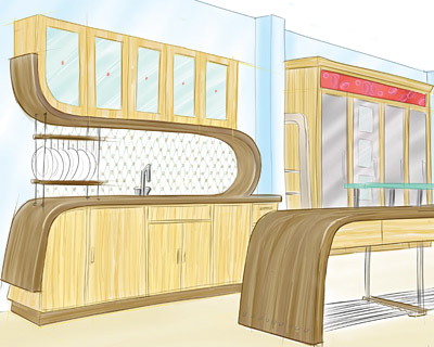
Johnny Grey Studios designed the Dexter kitchen inspired by the character’s South Florida lifestyle reflecting Miami’s Art Deco architecture and tropical setting.

Grey chose to depart from the typical predictable kitchen.  His blog discusses his desire to get away from the typical work triangle and create a space that will appeal to the visitors’ senses.

Immediately upon seeing the kitchen you can’t help but notice the curved walnut countertops.  I am reminded of the display Grey designed a few years ago for the Electrolux booth at KBIS.  It’s very disappointing there are not more pictures of the kitchen available.  I was able to find many photos of the Dexter Dining Room.

Grey used many natural materials including Aspen, Walnut, Blogged Oak, Zebra grain Maple, Bloodwood and Teak Tiles.   He used Caesarstone on the countertops, windows and bookcases to give a nod to Miami’s modern architecture.  Paints were also inspired by Miami and ranged from ocean blues to spicey hues.

Metropolitan Home’s Showtime House is located at 23 Gramercy Park South and will be open to the public for tours until October 26, 2008. Proceeds from the tour ticket sales will benefit Nemcova’s non-profit organization, Happy Hearts Fund. For more information about tickets and tours at the showhouse, visit www.methome.com/showtime.


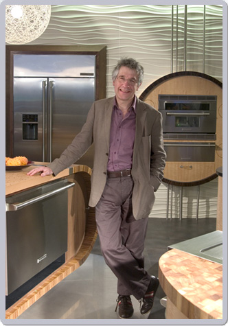
 Design Johnny Grey

Simpler Color Trends

The economic slowdown and a push to reconnect with nature will result in simpler design styles and color choices heading into 2009.

Architecture and design emerging next year will be taking cues from four concepts: “raw,” “urban silence,” “simplexity” and “private identity,” says a color and design specialist with Benjamin Moore Paints.

“We are going to see more of a ‘make do with what you have’ attitude and paring down austerity in design,”

Raw– This palette is derived from unfinished wood, cinder blocks and other “make-do” materials and includes shades of white, sand and gray. The raw palette will layer white on white, with textures and shapes to add visual interest. Gray and monotones will be embraced with tonal shifts ranging from beiges to near-black.

Urban Silence– This group of colors reflects the changing delineation between life in the city and life outside the city.  As more urban buildings incorporate rooftop gardens and shipping containers are converted into living spaces, the city becomes a softer, more livable place. These changes are reflected in the palette by mixing the gray tones of urban living with vibrant, organic colors like green, rust and terra cotta.

Simplexity– The best way to think of “simplexity” design is repetitive patterns clustered into simple formats.  The repetitive pattern brings order to chaos. Simplexity colors are very complex, they have a lot of depth to them, but they’re easy to use.An example is a color that looks black, but it’s really purple. It’s almost black but it has an undercurrent of blue and red running underneath it and the way that the light hits it, you start seeing the nuances of how those colors flip underneath it.

Private Identity – deals with how we express our individuality and differentiates between the individual and the world. Colors will include organic brights teamed with pales to create unusual pairings. Metallics will be warm and cool, while surfaces, especially blacks and vinyl, will have slick, wet looks. Denim and brass will be key features in this forward-thinking trend.


Best Use of Plastic Spoons

Upcycled lighting | Kitchann Style

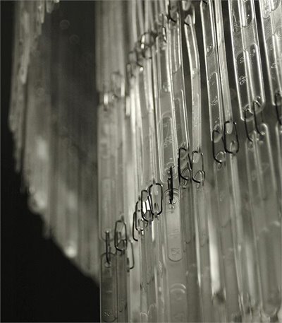
This 22″ x 16″ chandelier is made from recycled plastic spoons by Studio Verissimo of Portugal.  Artisits Claudio Carduso and Telma Verissimo strive to make people smile with their creations.

From a distance the chandelier looks like it is made from Lucite.  Very luxurious for only $300 from Eekowire.

Place this in your eating area and you will have an instant conversation piece.

I’d like to see an extra long chadelier with more lights inside.

Add to FacebookAdd to NewsvineAdd to DiggAdd to Del.icio.usAdd to StumbleuponAdd to RedditAdd to BlinklistAdd to Ma.gnoliaAdd to TechnoratiAdd to Furl

Artful Concrete Flooring

I am a big fan of concrete floors.  I am also in love with swirly flower motifs right now.  Combine the two together and you have the most gorgeous concrete floors I have ever seen.

This concrete floor rendering is the creation of Transparent House, a San Francisco based architectural rendering company.  It’s a perfect juxtaposition of a cold, hard, industiral material with warm, whimsical, organic design.

I want to rip my floors up right now.  My wall to wall carpet feels so uninspired.  If only…