Around the Web

I can’t easily post while I’m out of town, thanks to the generosity of Brizo, so I have compiled some interesting posts from around the web.

There’s a great post from HGTV.ca Style Sheet Blog on small dining spaces.  The photos are quite lovely but what really caught my eye was the folding table that doubles as a picture frame. These tables are not a new idea but the way the legs disappear when upright is nice and the poster insert adds a modern touch.

Staying on the modern theme, Modern Home Interiors features a sleek glass vanity by Antonio Lupi.  The Briliante vanity features 20mm thick glass top and sides with an integrated bowl.  A small storage cabinet situated below the vanity holds bathroom necessities. The Dama mirror is featured above the vanity.

I personally need much more storage in my bathroom and I could probably never keep the glass clean.

Michelle from My Notting Hill talks about mosaic tile as art.  With large format tile the trend for interior floors, we often don’t think about putting beautiful  mosaics anywhere other than the bathroom or the kitchen backsplash.

Her blog features some new patterns from New Ravenna Mosaics and Stone – which I am a huge fan of.

For an in-depth look at the history of Mosaic Tile  Linda Merrill posted  a great article on the Surroundings Blog.

These days it’s best to invest your money in the areas of your home that will get the most show.  Showing off your expensive taste is best done without trying too hard, unless you are a Hip Hop Mogul, but instead investing in a few special pieces.

I highly recommend checking out the Magic Rug.  These gems from Sicis combine the beauty of hand-cut, artistic Italian mosaics with the flexible format of a throw rug. The glass mosaic is mounted on a polyurethane base that can be attached to the floor or left as a movable object. Seemingly endless possibilities include  florals, classic patterns, and contemporary motifs in a variety of formats—including circular, square, and oval—can be customized with 80 colors and an assortment of effects (iridescent, transparent, or opaque)

Add to FacebookAdd to DiggAdd to Del.icio.usAdd to StumbleuponAdd to RedditAdd to BlinklistAdd to TwitterAdd to TechnoratiAdd to Yahoo BuzzAdd to Newsvine

24″ Ranges

A 24″ range is a great appliance for a tiny kitchen.  While the choices were once slim, today there are many to choose from. 

Fisher & Paykel smooth top range
This little gem has a sleek glass top and a warming drawer with moisture selector. The self clean cycle makes it great for a busy home.

Fish & Paykel range

BlueStar Range with swing door
The versatility of this all-gas range makes it a favorite.  The griddle top is a must for a vacation home.

bluestar-range

American Range commercial grade range
This range offers sealed burners with infinite controls and multiple oven settings including convection.  The large glass door makes keeping an eye on food easy.

American Range

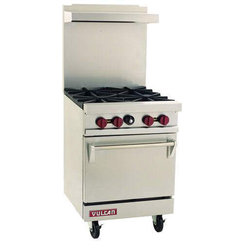
Vulcan restuarant-style 24″ range
This little powerhouse offers 115,000 total BTU with the oven totalling 35,000 BTU.  Option casters are available too.

vulcan range

Avanti  duel fuel range
If you prefer a duel fuel range, the Avanti is a great choice.  It’s self-cleaning oven reaches temperatures between 120 and 480 degrees.  If you are really tight on space, Avanti also offers 20″ ranges.

Avanti range

Smeg gas range
This beautiful range comes in all gas or a dual fuel model.  Heavy duty continuous grates can handle the largest of pots.  9 cooking modes are available as well as an electronic cooking display. Optional LP conversion kit is also available.

 Smeg Range

Bookmark 24

Around the Web

white industrial kitchenAs I was strolling the world wide web this past week I found some great items I thought I’d share starting with this incredible white kitchen in a Barn-style home in Sag Harbour from Emma and her great Blog White and Wander.

I love the commercial-style faucet and industrial stainless steel surfaces paired with the clean white shelving filled with glasses and clay pitchers.  Check out her other posts filled with lost of interior goodness.

The Laurel Hedges has a fun post that tells of the little known secret that a powerful exhaust fan in a couple’s bathroom lowers the chance of divorce.  Millie blogs to get away from the men in her life ( she has 5 sons!) and her posts are refreshing and filled with wonderful little gems.

Small kitchens are hard to design because they still have to have all the appliances found in larger kitchens and at least a little storage.  I think Chris Welsh did a fabulous job on this alcove kitchen featured on Alicia B. Designs with her tips on how to maximise small kitchen space.

If you have missed the magazine Domino then you will love the new online magazine, Lonny.  Eddie Ross introduced me to the new publication on his blog.  His beautiful farmhouse has a fabulous spread in the 200 or so page publication.  I love what he and his partner did with their butler’s pantry. Everything is beautifully organized and very accessible.

exhaust fans will save your marriage   Chris Welsh alcove kitchen

Eddie Ross Butler's Pantry   lonny mag

Kitchen Critique

There are many things about this picture that I like and there are some I dislike. I like the open feel and the contemporary hood.

colombini cucine

I like the deep chocolate color on the walls although I think I might like it more as an accent color on the right wall with a different color on the back wall.

I like the tall pantry cabinets for their ample storage and sleek, hardware-free fronts.

I don’t like the low wall cabinets.  As you can see by the picture only a few books will fit under them.  I also dislike the white end panels on the base cabinets.  I’d rather see the wall cabinets either hung higher or sitting all the countertop.  I’d remove the white end panels and run the countertop over the sides to the floor.  If the wall cabinets are to sit on the countertop prefer the countertop not to match the cabinets so closely.  I think a white marble would look better.

The sole beam across the ceiling also bothers me.  I don’t mind the white on white but I think the ceiling would be more interesting if faux beams were added to create a nice visual rhythm.

This kitchen would also probably be very dark at night.  Additional lighting should be added at the sink and at least one prep area.

What do you think on the T-shape kitchen?  I think it might make more sense if there were a table and chairs located on the right side to create an eat-in kitchen.  They might have been removed for the photograph to show off the cabinetry.  The corner of the sofa may have been moved into the frame to keep the space from looking too empty.