PANTONEView Home + Interiors 2020 Color Guide
While you may still be in the midst of decking out your beach house in Spring’s haute hues; believe it or not, color trends for the new year are already in.
The Pantone Color Institute, the authority behind the Color of The Year, has released 72 colors in eight color palettes that offer designers an “unusual and original approach” to home decor and interiors for 2020.
A New Era
2020 is both a new era and a new dawn. Leatrice Eiseman , executive director of the Pantone Color Institute, predicts this new era will reinforce the notion that muted and vibrant tones can co-exist, and that a traditional style, especially when tweaked with futuristic touches, offers an unusual and original approach to a product or interior.
8 Pantone Color Palettes
For 2020, Pantone predicts diverse color palettes with never-ending patterns and combinations will be the name of the game .
In a keynote address given at the 2019 International Home + Housewares Show, Eiseman share that black and white striping overlapped with another pattern will be one of the hottest trends. Another trend will be sparkly metallics such as gold paired with unexpected materials like wood. Another trend to look out for is felted products which are becoming popular, as are birds and feathers.
Here are some of the home and interiors 2020 palettes to look out for and a few inspiration collages I have created to help inspire you.
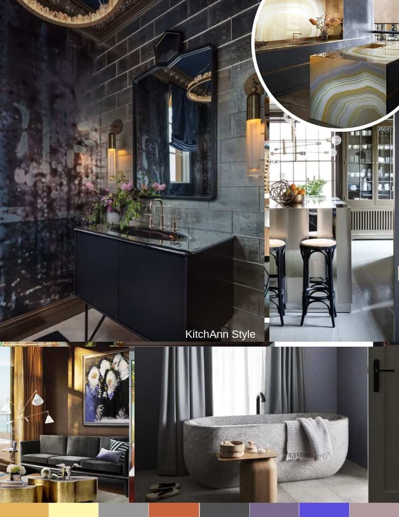
Metropolis – high rise glimmer, industrial glamour
Metropolis speaks to big city living. It is a mix of glamour and industrial chic, of striated old-world marble and deepened wood patinas used with futuristic metallics. Accents of vintage plum wine and elegantly deep lavender add as sophisticated touch to this urbane and stylish environment.
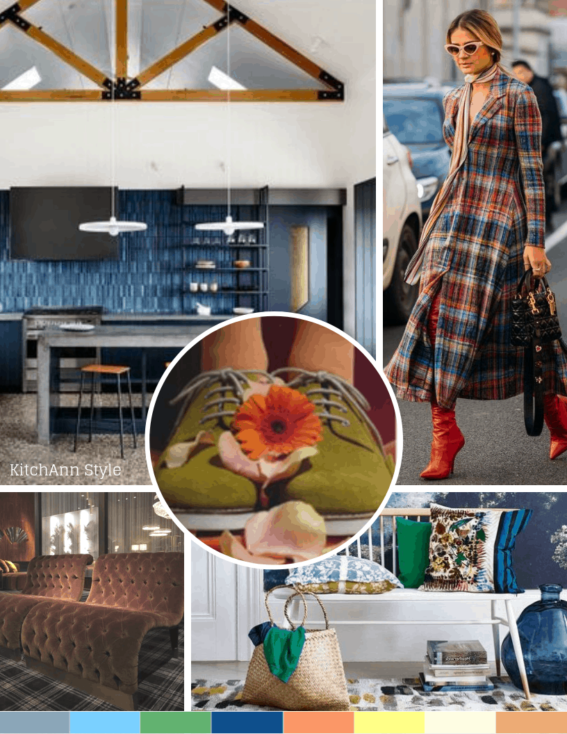
Trekking – quietly responsible, physical and transcendental
Trekking is “a grounded palette” that takes us away from the big city into the great outdoors―a place to escape the noise and the traffic, take a deep breath and appreciate our natural surroundings.This is a palette very much influenced by fashion favorites of plaid flannel, well-worn denim and sturdy brown boots that were meant for walking.
Translated from fashion into interiors, this color grouping invites a casual, comfortable unpretentious, no-frills-attached environment punctuated by the energy of red and the warming presence of a spicy mustard tone. A metallic steel wool adds a surprising and sturdy presence to the palette.
Skill Set – modern artisans, shaped by hand
This is a palette that celebrates the skill sets necessary to create products that are utilitarian, functional, yet still refined, artful and engaging. It evokes the hues of hand-thrown pottery, hand-tooled leather, forged steel treatments and wine-dyed spoons rescued from old oak barrels.
Prints Charming – creative and confidant, cheeky irreverence
This palette is inspired by an image of a modern-day Prince Charming dressed with some traditional Royal stylings but with some modern twists, including patterned tattoos. Bright royal colors are calmed by an umber brown and a minted green; black and white provide contrast to it all.
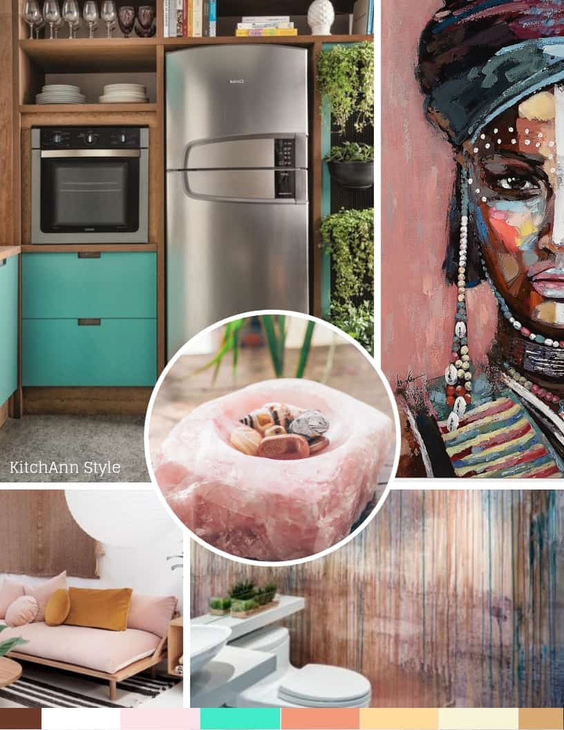
Beyond the Pale – modern and multiculteral, spirited feelings
Beyond the pale pushes pastels to another level. In this palette different permutations of pinks (light, bright, muted, dusted, etc.) are complemented by smoky green, blue-green, a mid-tone Infinity blue, a lively greenish-yellow and a contrasting tawny brown.
Tempered Tastes – subtle dreamlike gradations, natural and organic
Tempered Tastes characterizes a contemplative, quiet palette, one that inspires softer and more intimate spaces and subtle color choices. Charmingly understated, the mood is even further enhanced with the addition of shimmery metallic such as Pantone’s Gold Leaf and rose-toned Agave Nectar that lend an intriguing surface treatment to this discreet group of shades.
Show Stopper – vibrant color mixology. applause!, applause!
The energy is palpable in this palette packed with vibrant hues. It’s a combination that kids (or kids at heart) would be drawn to. It is about unabashedly attracting attention and making a statement, and the names of the colors help to tell the story.
Aurora Yellow and Spectra yellow are the headliners, most often paired with Deep Periwinkle. The momentum gathers as Red Orange enters the stage, forming a trio with turquoise and Purple Orchid. Twinkling Diode Blue and a whimsical green called Leprechaun Dust might very well be the star attractions.
Tea Garden – simply pure and poetic, contentment
Evoking the calm and natural beauty of a Japanese tea ceremony, this palette expresses a thoughtful aesthetic suggesting humility, simplicity, harmony, respect and tranquility.
The colors used in this palette fit perfectly into the aesthetic―blue in the shades of sky and sea, serene greens and lavender, both matcha-toned, yellow-green and a pungent chai shade, and for a finishing flavor, a touch of mango.

The Pantone trend book contains visual inspiration, color themes and suggested color harmonies. CMYK printing equivalents are supplied for each of the forecasted colors making it easy to achieve the right match in your designs.
Last year I think my favorite inspiration board was for the Proximity Palette. This year, I’m really drawn to the spirit of Beyond the Pale. Which is your favorite?
images via Pinterest


WOW! I just love these mood boards/ color boards you created. I can see that you spent a lot of time to showcase the new colors. I’m feeling inspired. Thank you.
I’m so glad you found something that offers inspiration!
Really well done. Thank you for sharing this.
Thanks for coming by and commenting!
I love Prints Charming! This was a fun read!!
Prints Charming is very fun – and kind of intimidating!
I’m liking the Tea Garden themed palette. What a fascinating way to categorize the trend predictions! Thanks for sharing!
Thanks for stopping by and telling me which palette you like.