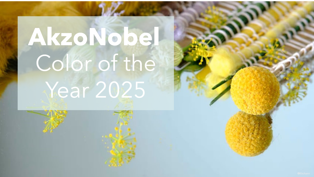
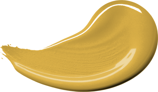
If any color could paint a smile on your face, it’s True Joy, AkzoNobel’s Color of the Year for 2025. True Joy is an uplifting, sunny yellow shade that will fill your home with creative energy, optimism and pride.
True Joy is much more vivid than the muted colors selected by AkzoNobel in years past. I’m a little surprised at the selection considering Wild Wonder was the hero color for 2023.
As we move towards 2025, there is a growing desire to take a joyful leap into the unknown, celebrate craftsmanship, and embrace our true selves. True Joy captures the essence of this moment, helps designers like me encourage clients to dream about creating a home that gives them a sense of optimism and pride.

“True Joy is a versatile color with the power to transform. From automotive interiors to tech products, fashion, and home decor, it injects optimism, pride, and creativity into any design. This color serves as a reminder of how design can inspire, innovate, and elevate the everyday.”

True Joy works brilliantly as a statement color – especially with complementary plums and blue shades. Waking up in a happy bedroom makes for a great start to any day – don’t you agree?
Research shows that even small moments of joy can shift our mindset, inspiring positivity and creativity. Imagine shifting away from the over-done grays from the past few years and experiencing the colors and craftsmanship that spark happiness.
The selection of True Joy comes after in-depth research into the cultural, economic, and social trends that influence color preferences. To help designers and manufacturers integrate True Joy into their work, AkzoNobel has created their Color Forecast 2025.
The AkzoNobel Color Forecast (known as Dulux and Flexa in European Markets) is further divided into three color palettes for different market segments.
These palettes predicts that rich burgundies and wine hues will dominate residential interior design, alongside green tones including olive, sage, and a vibrant yellow-green.

I really like the Dulux Still Palette with its calming neutrals and greyed midtone accent shades that exude warmth and a sense of ease. I also find it very close to the Sherwin-William Color Capsule of the Year 2025 – the first time they picked a palette of nine different shades instead of a COTY.


