Wallpaper: Like Light on the Horizon

I’m crushing on the Aurora Collection of nonrepeating wallcoverings by Calico Wallpaper. This ephemeral collection features luminescent ombré washes is 16 colorways.
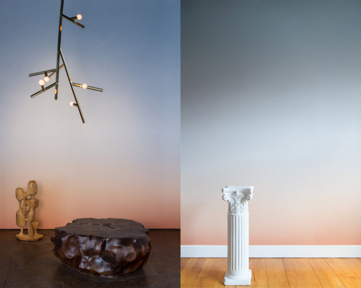
Aurora Collection | KitchAnn Style

Calico Wallpaper was founded in Brooklyn, New York in 2013 by creative and life-partners Rachel and Nick Cope. Their process combines artisanal methods from the decorative arts with innovative digital technologies. The result is an entirely customized and non-repeating wall mural.

Inspired by horizons at dawn and the phenomena of light, new Aurora papers are meant to immerse viewers in waves and washes of color.

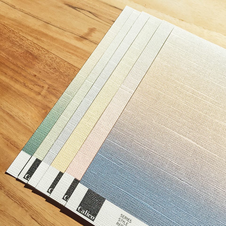
Building upon research into the Japanese and Turkish arts of Suminagashi and Ebru that went into creating its inaugural collections, the Calico team continued to explore the art of fabric dying. Mosler creates Aurora by hand by suspending mineral pigments, such as ultramarine and indigo, in liquid and transferring them onto organic linen. The texture of the linen lends depth, and the pigments allow it to achieve a glow that appears to come from within the material.
Aurora Collection | KitchAnn Style

The 16 patterns include the popular blue-green Bayou, dawn-like Ray, and cerulean-tinged Tulum. The collection was inspired by the couple’s international travels, particularly the time they spent at the artist residency Villa Lena in Italy.

The Type II wallcoverings are customized to fit project dimensions and appears seamless when installed. The maximum width of panels is 52”. Priced at $32 per square foot.

Aurora Collection | KitchAnn Style


Dekton Offers Five New Colors

Dekton by Cosentino introduces five striking new colors that highlight the beauty of natural stone as part of the Natural Collection.

Aura: A New Design Concept

Aura replicates the elegance and beauty of Calacatta marble with large-scale veining for an impactful design statement. Aura provides a stunning option for those interested in the luxurious look of marble – a trend that has shown a recent strong resurgence in the U.S. market – without the maintenance issues typically associated with natural stone.

Dekton Aura | KitchAnn Style

For the first time, Cosentino has developed a slab design with an endless symmetrical pattern. Aura can be composed so that the veining continues from one slab to the next, giving a true mirror effect known as “book-matching.”

Dekton Aura Bookmatch | KitchAnn Style

Edora

Edora is uniform in color yet contains delicate, undulating textures offering a minimalist concept and a natural look. Its warm neutral tones are distinctly stylish and classic.

Dekton Edora | KitchAnn Style

Irok

Thin, delicate veining gives Irok its unmistakable appearance. Its creamy tones and a subtle movement evoke the look of limestone, offering enduring beauty for myriad of applications.

Dekton Irok | KitchAnn Style

Kairos

Another marble-like variant in the collection is Kairos, which offers a soft, white base striated with subtle, pale grey veining reminiscent of Italian Carrera marble. Its natural veining and milky appearance brings an elegant brightness for both classic and cutting-edge environments.

Dekton Kairos | KitchAnn Style

Vegha

The stormy taupe of Vegha reveals a layered depth, which is impactful yet neutral. Inspired by the formations of limestone and sandstone, its innovative look is sophisticated and versatile enough for a variety of aesthetics.

Dekton Vegha| KitchAnn Style

Dekton retails for $58-$96 per square foot, depending on thickness and color.

How It’s Made

Dekton is made using a proprietary process called Particle Sintering Technology (PST), which is an accelerated version of the change that rocks and stone undergo in nature when subjected to heat and pressure over thousands of years. Dekton has reduced this process to four hours with extreme heat and pressure resulting in an ultra-compact surface with superior technical characteristics.

Warranty

Dekton offers a 25-year limited residential warranty on the material. The warranty does not cover “commercial uses” of the Dekton products. “Commercial uses” include but are not limited to use in commercial buildings such as
retail stores, restaurants, offices, hotels, or apartment complexes.

Sherwin-Williams Color of the Year 2015

Sherwin Williams Coral Reef | KitchAnn Style

Sherwin-Williams Coral Reef | KitchAnn StyleI was going to combine the Sherwin-Williams Color of the Year post with the previous post about AkzoNobel’s Color of the Year 2015 choice but I found so many great inspiration photos I decided I had to break it out.

Sherwin-Williams chose Coral Reef (SW 6606) as their Color of the Year 2015. It’s part of the Buoyant color palette I wrote about previously.

“Its unexpected versatility brings life to a range of design aesthetics, whether traditional, vintage, cottage or contemporary.” -Jackie Jordan, Sherwin-Williams director of color marketing.

Sherwin Williams Coral Reef | KitchAnn Style

Coral Reef is warmer than AkzoNobel’s Copper Orange and is a wonderful compliment to the Blues that have been popular these past few seasons.

Sherwin Williams Coral Reef | KitchAnn Style

Coral reef plays happily with white, black, lush greens and lilacs. For a more subdued palette, mix it with warm neutrals such as gray and soft browns.

Sherwin Williams Coral Reef | KitchAnn Style

Coral Reef is not the pumpkin color from the 50’s. It’s  a softer, more approachable color.

Sherwin Williams Coral Reef Exterior | KitchAnn Style

Since Coral Reef is such a flattering color, it’s well suited for use in bathrooms. Who doesn’t want to have a youthful glow?

Sherwin Williams Coral Reef Exterior | KitchAnn Style

Pair Coral Reef with matte gold or brass for a luxurious vintage feel.

Sherwin Williams Coral Reef Exterior | KitchAnn Style

Don’t limit the color to the interior. Consider brightening your home’s exterior by applying it to your front door, shutters, flower boxes or garden structures.

AkzoNobel Color of the Year 2015

AkzoNobel Copper Orange | KitchAnn Style

AkzoNobel Copper Orange | KitchAnn StyleAs I wrap up my coverage of trending colors for 2015, things are heating up as a warmer spectrum of pinks, reds and oranges emerging, reflecting optimism and a renewed emphasis on sharing.

AkzoNobel, the largest color and coatings manufacturer in the world and maker of Dulux Paints, named Copper Orange as their Color of the year for 2015.

By closely monitoring the emerging social, economic and design trends around the world, a select panel of professionals predicts future color trends two years out.

“The overriding idea for 2015 is that people are finding new ways to add color to their lives and are developing a warmer and more caring environment for all.” – Heleen van Gent, Creative Director of AkzoNobel’s Global Aesthetic Center.

AkzoNobel _Copper_Orange_KitchAnn_Style_wall

Warm and surprising, Copper Orange reflects a more positive outlook on the world while representing a new emphasis on putting the + (plus) in everyday. This flattering hue will surely be popular in the cosmetics industry just like the Pantone Color of the Year 2015, Marsala.

AkzoNobel Copper Orange | KitchAnn Style

Copper Orange works well paired with neutrals. If you tend to shy away from color, go for small accessories and simple accents like this drapery edge treatment.

AkzoNobel Copper Orange | KitchAnn Style

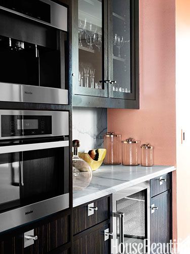
The Copper Orange walls are a nice balance with the dark cabinetry and make this kitchen cheery.

AkzoNobel Copper Orange | KitchAnn Style

“It’s a “hot” color that evokes tropical fruit and flowers, Eastern culture as seen in Buddhist monks’ robes and, in the West, autumn’s warm glow.” 

AkzoNobel Copper Orange | KitchAnn Style

Express your Nomadic, adventurous side with relaxed decor and a textural application of Copper Orange.

AkzoNobel Copper Orange Bedroom | KitchAnn Style

Copper Orange can also be quite sophisticated. The small Copper Orange print is gorgeous in this gray bedroom.

AkzoNobel Copper Orange Bedroom | KitchAnn Style

I predict the popularity of Copper Orange will increase the use of Rose Gold, already popular in the fashion industry, within the home.

Copper Orange has been selected to complement all of the major trends that AkzoNobel has identified for 2015 – all inspired by one larger idea, “Everyday + Finding the wonderful in the normal”.  For more on their trend forecast, visit www.colourfutures.com