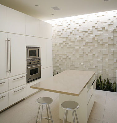
Here’s a great small white kitchen to start the new year with fun and style.
I love the three dimensional wall treatment with the lush green from the plants inside and out.


Cheers to a Bright and Wonderous 2012!

Design | Wellness | Cabinetry
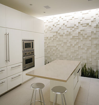
Here’s a great small white kitchen to start the new year with fun and style.
I love the three dimensional wall treatment with the lush green from the plants inside and out.
Cheers to a Bright and Wonderous 2012!

I really like the use of these salvaged doors by Dutch designer
Piet Hein Eek. What do you think?
Does it work because they are in a loft/industrial setting or is it a misstep?
Have a Good Weekend!
 Goodbye Honeysuckle Yellow, hello Tangerine Tango, or you may prefer to call it 17-1463, announced as Pantone’s color of the year for 2012.
According to Pantone, “Tangerine Tango marries the vivaciousness and adrenaline rush of red with the friendliness and warmth of yellow, to form a high-visibility, magnetic hue that emanates heat and energy.”
It is a color, Pantone goes on to say, that is “a bit exotic, but in a very friendly, non-threatening way”.
There are so many gorgeous colour combinations possible here – you can really let your imagination run wild.


Would you ever think of purple as a neutral? According to color experts at the Color Marketing Group (CMG), they predict their 2012 color of the year Boyz-N-Berry will work well as a neutral – subdued with taupe, brown or gray.

“deep rich purple with slight red undertones…
it is mature and elegant yet has a youthful edginess. It
reflects our changing mindset on so many issues —
off centre and unconventional, spiritual, meditative yet
impulsive. It is serene and in control.” It is also able to
blur the line, being both masculine and feminine and
appealing to everyone.
This color seems less grey than the CMG’s Next Color 2010: Mardi Grape. One of Pantone’s must-have colors for 2011 included a purple called Phlox.
It is true that trends are lasting longer and color tones evolve into something new yet still familiar.
For a room to feel “put together” the interplay of textures and colors are key and the magic is made in the combination rather in the individual colors.


