Around the Web

I can’t easily post while I’m out of town, thanks to the generosity of Brizo, so I have compiled some interesting posts from around the web.

There’s a great post from HGTV.ca Style Sheet Blog on small dining spaces.  The photos are quite lovely but what really caught my eye was the folding table that doubles as a picture frame. These tables are not a new idea but the way the legs disappear when upright is nice and the poster insert adds a modern touch.

Staying on the modern theme, Modern Home Interiors features a sleek glass vanity by Antonio Lupi.  The Briliante vanity features 20mm thick glass top and sides with an integrated bowl.  A small storage cabinet situated below the vanity holds bathroom necessities. The Dama mirror is featured above the vanity.

I personally need much more storage in my bathroom and I could probably never keep the glass clean.

Michelle from My Notting Hill talks about mosaic tile as art.  With large format tile the trend for interior floors, we often don’t think about putting beautiful  mosaics anywhere other than the bathroom or the kitchen backsplash.

Her blog features some new patterns from New Ravenna Mosaics and Stone – which I am a huge fan of.

For an in-depth look at the history of Mosaic Tile  Linda Merrill posted  a great article on the Surroundings Blog.

These days it’s best to invest your money in the areas of your home that will get the most show.  Showing off your expensive taste is best done without trying too hard, unless you are a Hip Hop Mogul, but instead investing in a few special pieces.

I highly recommend checking out the Magic Rug.  These gems from Sicis combine the beauty of hand-cut, artistic Italian mosaics with the flexible format of a throw rug. The glass mosaic is mounted on a polyurethane base that can be attached to the floor or left as a movable object. Seemingly endless possibilities include  florals, classic patterns, and contemporary motifs in a variety of formats—including circular, square, and oval—can be customized with 80 colors and an assortment of effects (iridescent, transparent, or opaque)

Add to FacebookAdd to DiggAdd to Del.icio.usAdd to StumbleuponAdd to RedditAdd to BlinklistAdd to TwitterAdd to TechnoratiAdd to Yahoo BuzzAdd to Newsvine

2010 Color of the Year: Turquoise

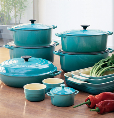
Pantone has officially named 15-5519 Turquoise as the 2010 Color of the Year.

For the last few years various shades of aqua, cerulean, teal, and ultramarine have been tremendously popular so this color choice doesn’t seem to be much of a stretch. The true turquoise shade that they have chosen does seem to have more depth and a higher concentration of green than the icy aquas we have been seeing.

Leatrice Eiseman, executive director of the Pantone Color Institute, says there was no runner-up to turquoise in her mind because people crave escapism and freshness after a tough year. The shade is on the cusp of blue and green, which makes it both inviting and serene — characteristics associated with blues — and invigorating and luminous, which comes from green, she says.

Pantone’s color for 2009 was mimosa yellow, intended to carry a hopeful, optimistic message. Eiseman says the public is shifting gears as the economy shows some improvement: They are ready to fantasize a bit about the beach resort.

Whether envisioned as a tranquil ocean surrounding a tropical island or a protective stone warding off evil spirits, Turquoise is a color that most people respond to positively. It is universally flattering, has appeal for men and women, and translates easily to fashion and interiors. Here are a few pictures for inspiration.


Bookmark 2010 Color of the Year: Turquoise

Starck By Warendorf

stark dualityAs Miele kitchens re-brands itself and takes on the name of the German town in which the company is based – Warendorf – it is making this change with a new kitchen destined to make a significant impact.

They’ve chosen one of the biggest names in design – Philippe Starck – to develop the first kitchen under the new brand.

Starck has created a kitchen design that represents something of a departure, both emotionally and functionally, from the traditional wall-to-wall arrangement of the fitted kitchen.

He calls the concept “democratic design” because its wide range of individual elements and the ability to combine them in different ways gives it potentially wide appeal to a range of consumers, lifestyles and spaces.

Starck’s first kitchen design concept, Starck by Warendorf, is complemented by functional tables that can be integrated into every Philippe Starck kitchen but may also be used as a standalone concept. It is a modular system made up of kitchen elements and individual pieces that leave all interior design options open.

A key element of the Starck by Warendorf concept is the way it combines living functions with the functions of eating and food preparation.

Starck does this with a number of specific design references. His bookshelf-style elements are intended to combine culture and food in the domestic kitchen. The bar-style counters are a response to the changed dynamic governing meal times.

Starck has banished visible appliances from these kitchen designs. Refrigerators, freezers, dishwashers, ovens etc are all concealed behind handleless unit fronts. The accompanying exhaust hoods disappear into the ceiling when not in use.

stark library stark_tower stark primary

Add to FacebookAdd to NewsvineAdd to DiggAdd to Del.icio.usAdd to StumbleuponAdd to RedditAdd to BlinklistAdd to TwitterAdd to TechnoratiAdd to Furl

Color Trends for 2010

rooted color trend | KitchAnn Style

New color trends presented recently by Sherwin Williams reaquaints designers with the past for inspiration in the near future.

Rooted
rooted

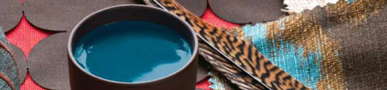
Rich, earthy colors associated with African, Aboriginal, and Native American cultures.  Inspiration comes from members of Ethiopian tribes who paint their bodies with green and red pigments sourced from volcanic ash, as well as weeds, grasses, and shells. The deep teal and ash gray of African wildlife and landscapes, as well as the bright designs of the locals’ textiles and beads, also serves a launching point for new designs.

Simplified
simplified-hrd

Lines are well-tailored and clear, translucent materials that reveal shape and structure. This is a nod to the Bauhaus style of architecture, with its absence of ornamentation and its harmony between form and function. A current example of this trend is Guggenheim Museum.

Treasured
tresured

Elements are weathered and the design is enhance  by organic aging. An example is the Rough Luxe Hotel in the United Kingdom, where the original layers of peeling paint and ancient wallpaper are still visible on the walls. This “less-than-perfect aesthetic” also includes the use of distressed leather, vintage tapestries, found objects, and patina.

Refreshed
refreshed

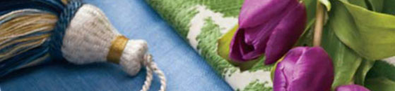
Bright, energized floral colors that evoke optimism and exuberance.  “Flower power” of 1960s vintage, with a hippie spirit makes a return. Lemonade yellow, crisp green, and vivacious violet are among the colors that play into this theme.  These vibrant colors comes partly as a response to the challenging times and a need for something positive to balance out the stress many are currently facing.

Add to FacebookAdd to NewsvineAdd to DiggAdd to Del.icio.usAdd to StumbleuponAdd to RedditAdd to BlinklistAdd to TwitterAdd to TechnoratiAdd to Furl