Behr’s 2021 Color Trends Palette is an ode to elevated comfort and the transformative and healing power of a home that has managed to wear many hats during the pandemic. The Palette is comprised of 21 shades ranging from warm-toned neutrals to bright, sunny colors.
The BEHR Color Trends 2021 Palette is a curated selection of hues to create a desired mood that complements your style in any space.

The BEHR Color Trends 2021 Palette is organized into six color themes: Casual Comfort, Optimistic View, Subtle Focus, Calm Zone, Quiet Haven, and Outdoor Escape. Each theme evokes positivity in a variety of design styles, and each color was chosen for how it complements other colors—meaning, you can mix and match colors from each of the themes to suit any design aesthetic.
“This has been a year of unpredictability and 2020 has significantly changed our relationship with our home. When our color team began exploring a palette for the coming year, we knew it needed to be grounded in what we’ve been craving: comfort and personalization,” said Erika Woelfel, vice president of color at Behr. “A new, ‘elevated’ articulation of ‘comfort’ goes beyond traditional beige, gray and green hues, and embraces color in a way that can redefine and enhance any type of space inside or outside the home.”
BEHR Color Trends 2021
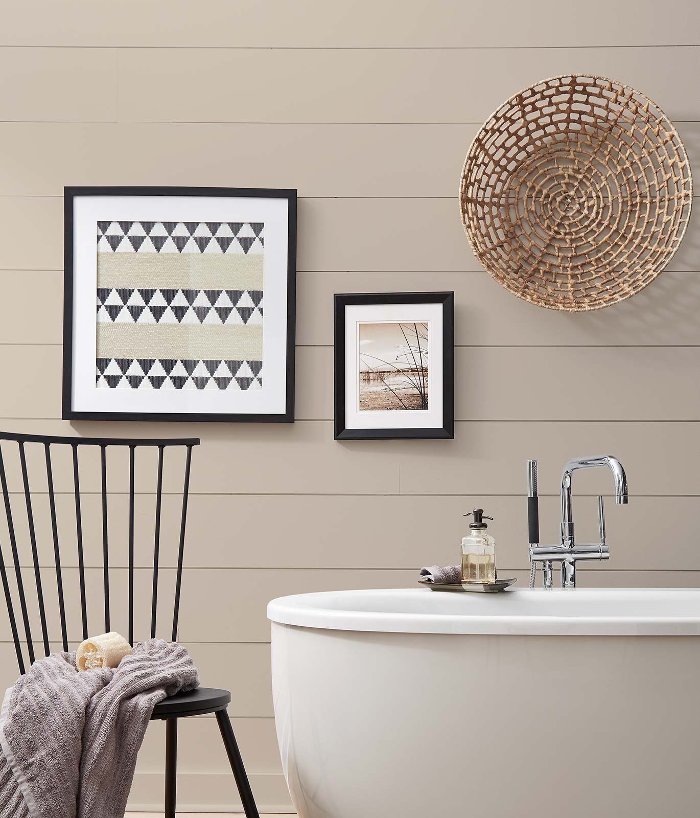
Casual Comfort: Light and cozy neutrals offer an updated take on the casual farmhouse look, achievable with warm-toned hues like Almond Wisp PPU5-12 and Sierra N240-4.

Optimistic View: An eclectic mix of bright, luxe shades evoke a Mediterranean or ’70s glam vibe, featuring festive colors like Saffron Strands PPU6-02 or Kalahari Sunset MQ1-25.

Subtle Focus: Soft pastels like Seaside Villa S190-1 and Wishful Green M410-2 are inspired by modern versions of art deco design and styling.

Calm Zone: Nurturing blues and greens continue to trend alongside our society’s desire for self-care and wellbeing, with colors like Jojoba N390-3 and Voyage PPU13-07 creating calm, restorative spaces.

Quiet Haven: Darker, evocative colors are fit for traditional and maximalist décor, with hues like Royal Orchard PPU11-01 and Broadway PPU18-20 at the forefront.

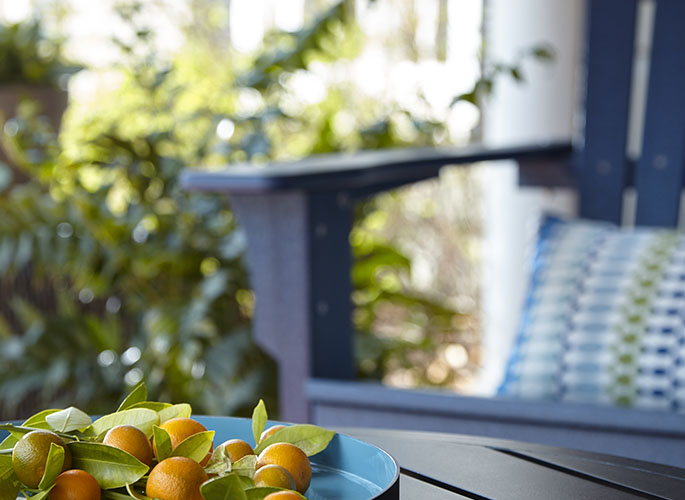
Outdoor Escape: Any shade from the BEHR Color Trends 2021 Palette can be used to add curb appeal and expand your home’s livable space, such as Barnwood Gray PPU24-07 or Cellini Gold HDC-CL-18.

To view each of the hues within these six themes, click here.


So true that our relationship to home has dramatically shifted. These are all beautiful color palettes. Thanks for sharing this inspiration.
So true! I often find myself leaning towards the softer palettes but I’m really loving the “Optimistic View” from BEHR.
Love the more vibrant and deep color palettes! So sick of white and pale gray spaces!
Pale, washed out spaces are so sleepy. I’m happy people are wanting to embrace color. Thanks for commenting, Linda!
This is so accurate – our relationship with HOME has changed dramatically this year and color is such a personal thing! Adding comfort and a sense of harmony with color has never been more important.
Thanks for stopping by, Janet. I agree with your comment.
Lovely use of color!
Thanks, Suzi!