Sherwin-Williams announces its 10th annual Colormix Color Forecast, with a single master palette to inspire professionals, creators and makers. The 42 colors, divided into six categories, were influenced by politics, culture, fashion, and more.
Each palette evokes a mood and a personality, with a cool mix of bold accent hues and versatile neutrals to make the look work in any space. Thinking of painting soon? Consider these mood boards for 2019.
“Every color in the Color Forecast, whether alone or when combined with others, tells a different story, a different riddle or different song, similar to the honesty found only in a written journal,” – Sue Wadden, Sherwin-Williams director of color marketing
2019 Colormix Color Forecast
Color Journal: Shapeshifter
Shapeshifter’s aesthetic is about the mystical, from the deep sea to the galaxy and everything in between and is rooted by strong geometrics and clean lines.
“The atmospheric wisps of color, grounded by deep, mysterious blues capture the unique space between technology and spirituality found in the Shapeshifter palette,” said Wadden.
INFLUENCERS:
RINGS OF SATURN, ARTIFICIAL INTELLIGENCE, SPIRITUALISM, HEALING ENERGY
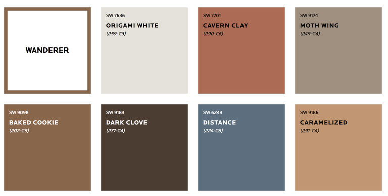
Color Journal: Wanderer
Sun-kissed and warm, this palette is for the person who will never be fenced in, who needs to soak in the endless horizons and subtle earthy tones of the high plains. Tones evoke baked clay canyons, worn leather and woven wool blankets of the true New West.
“The Wanderer palette is sun-washed and warm,” said Wadden. “It brings you to a modern desert made of one part cowboy, one part Scandinavian style that produces a luxurious result.”
INFLUENCERS: CAREFREE BOHEMIAN, MODERN COWGIRL, UNBRIDLED ADVENTURE, SOUTHWESTERN TWIST
Color Journal: Aficianado
Devotees of the best in life appreciate the well-worn, the bespoke and the rare. Like a bookcase of leather-bound classics, this polished palette evokes nostalgia and timeless tradition. With copper and gold anchored by merlot and deep, dark gray, these tailored tones make everything feel impeccable, tasteful and elegant.
“When we say ‘Aficionado,’ it evokes an emotion of what is best-in-life, well-worn and bespoke,” said Wadden. “It is ostentatious without being fake or showy, and has the right amount of charm to make it feel tasteful.”
INFLUENCERS: READING NOOKS, BRITISH ACCENTS, TWEEDY MENSWEAR, ’60S NOSTALGIA
Color Journal: Enthusiast
For those who go against the grain, break the rules or are more free-spirited than the status quo, the Enthusiast palette brings maximum attitude and yet produces harmonious results. The proof is in this palette, which features bold pops of vivid blue, green and red.
“The Enthusiast palette is a fresh take on ‘maximalism’,” said Wadden. “It’s an opportunity to have fun and push boundaries with color.”
INFLUENCERS: MAXIMALISM, COZY CHAOS, OVER-THE-TOP OPULENCE, MORE IS MORE
Color Journal: Naturalist
Nature lovers can connect with the wonder of the world in full bloom. This collection’s lush, sophisticated tones poke out from the rainforest as colorful tendrils. Ranging from mushroom to passionate pink, the focus on botanicals is slightly classic, with bold details.
“From conservancies to hothouses, Naturalist brings you into a chic, French woodland,” said Wadden. “It’s a place where color never fades.”
INFLUENCERS: FOREST MUSHROOMS, BOTANICAL PRINTS, BUTTERFLY COLLECTIONS,TERRARIUMS
Color Journal: Raconteur
From ancient rhetoric to today’s on-screen webcasts, there is a desire and appreciation for stories and the storytellers behind them. From Africa to the New World, human origins have been translated into this rich palette that spans time.
“From rich red to muted mauve, Raconteur represents storytelling itself,” said Wadden. “These stories are a subtle reminder of how everyone is connected.”


