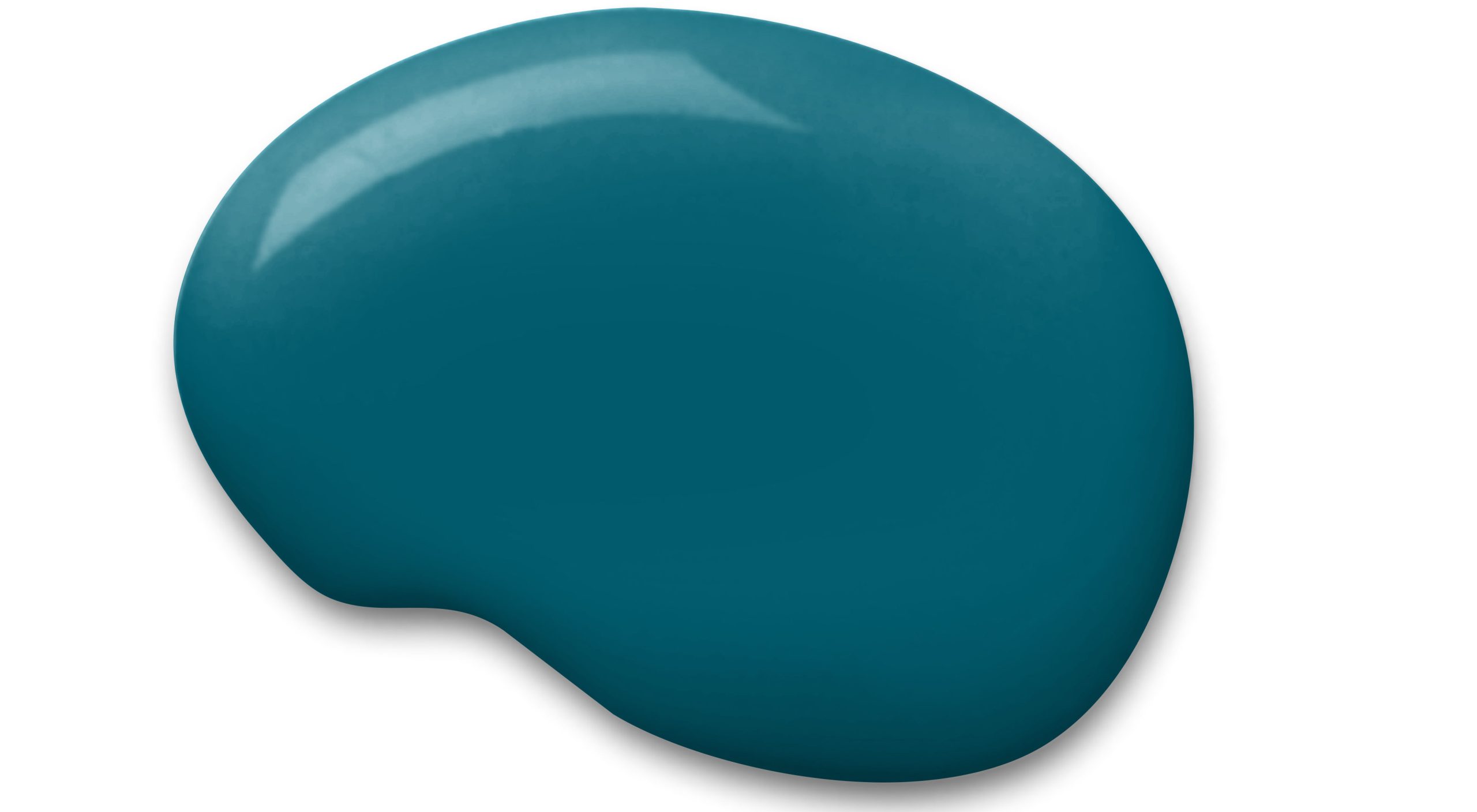
Sherwin-Williams has just revealed Oceanside, a rich, bluish-green jeweled toned hue, as its 2018 Color of the Year (COTY).
Oceanside, SW 6496 is a fun, lively choice for Sherwin-Williams which had picked two neutrals in previous years; Poised Taupe in 2017 and Alabaster in 2016. It’s described as “a complex, deep color that offers a sense of the familiar with a hint of the unknown, [that] bridges together a harmonious balance of blues and greens that can be found in what’s old and new.”
Sue Wadden, the company’s director of color marketing, says people today have a growing sense of adventure “and it is making its way into even the coziest corners of our homes.”
The lush cabinets make this open kitchen very inviting. This vibrant hue contrasts beautifully with the marble backsplash. It pairs beautifully with the brass lighting pendants and I love it mixed with the muted blue hutch and lavender chairs.
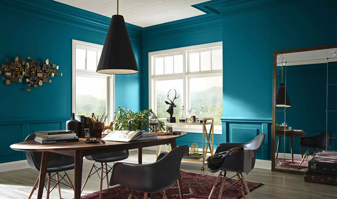
“Oceanside is reminiscent of the multi-tonal blues found in nature, offering a memorable, yet calming effect for public spaces,” says Wadden. “It is a new twist on navy, a common color for use in commercial spaces. When placed correctly, it is refreshing and offers dimension and depth as a statement color.”
2018 Colormix Forecast
A part of the ‘Affinity’ palette that was announced earlier this year, Oceanside is one of the colors in the 2018 Colormix Forecast. This palette reflects our need for making new connections and celebrates patterns and artisan crafts we find along the way. The folklore story of this palette is told with pops of fuchsia and gold mixed with grounded brown tones.
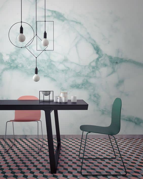
Faux marble wallpaper is one of the hottest Interior trends for 2017. Using Oceanside as inspiration, you can create a wall that’s a work of art.
Using Oceanside
Oceanside offers familiar inroads to bold color for developers, builders and interior designers. As with other colors found in nature, Oceanside can channel healing and tranquil emotions, but also spur heightened levels of creativity—making for a comforting first impression in an office or hotel lobby.
Some believe Sherwin-Williams’ choice of Oceanside signals the start of a design shift away from super contemporary spaces towards design that references 1950’s glamour.
Versatility
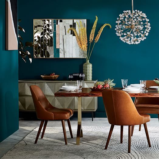
Oceanside is a versatile color. It pairs well with the current aesthetic en vogue, mid-century modern, and is a contemporary update with white marbles and metallic tones of copper and brass. It was part of the West Elm Spring 2017 palette, shown above.
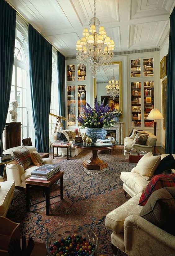
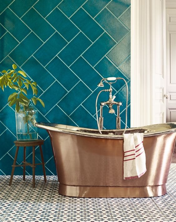
With all the experts saying we are craving tranquility in these uncertain times of political and social upheaval, the calming power of green can be very beneficial. Fortunately, you don’t have to be stuck with a boring green hue as evident by the amazing blue-green tile from Fired Earth used in the bathroom above.
Oceanside is fit for both interior and exterior spaces, so consider the shade for your front door or shutters. I also like it for siding on a Craftsman Bungalow style home.




You should make this post like into a definitive guide or something. I bet a lot of your new readers that come to this site would want to be able to find this post. It’s too good to keep secret!
I have been looking for ever on a blue tone for my house with a brown roof. Absolutely, absolutely love these two colors together as I have shakes I need to make another color too. I see in your your post you state the two colors, Oceanside and poised taupe for the brown. I really need to know what color is the trim around the windows and the decorative gable piece. It’s looks tan. Can you please post as I am going to sw today to get my samples. I sure hope my color samples look like the picture. This would be a life saver as I am tired of looking.
Thank uuuu so much
Thank you.
I’m so glad you found the inspiration you needed. Due to differences in screen color, it’s always best to test your paint color first.
Unfortunately, I do not know the trim color.