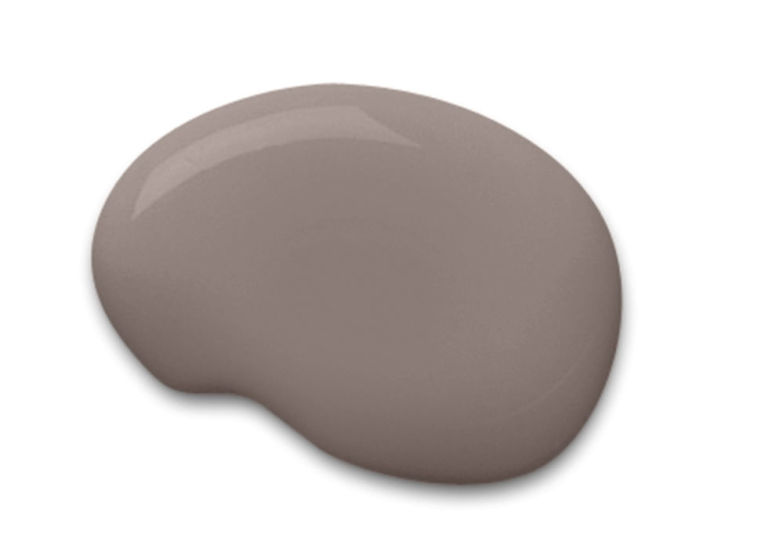
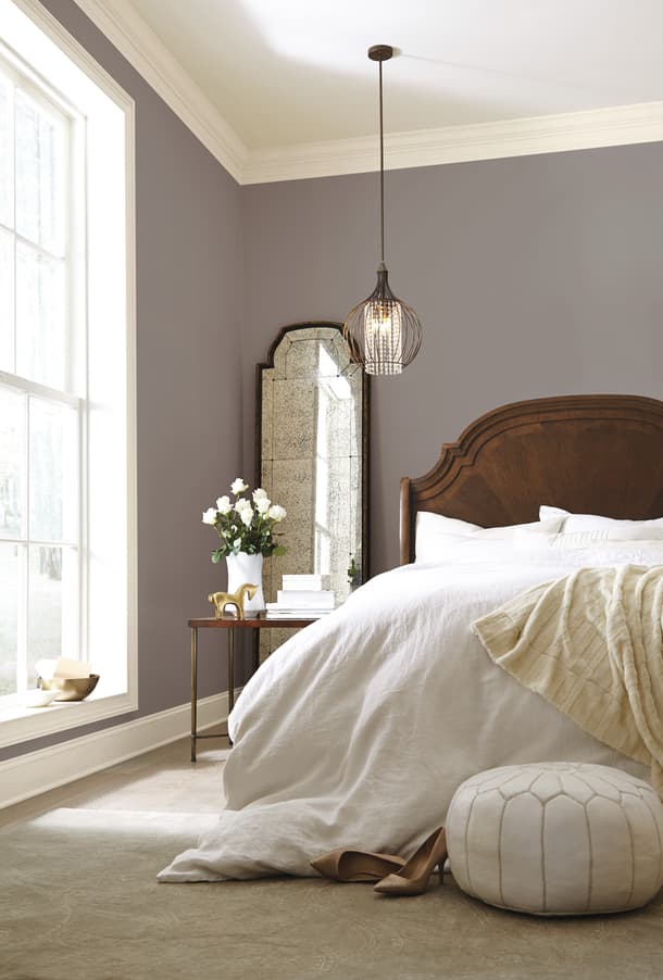
Sherwin-Williams has announced it’s pick for 2017 Color of the Year as Poised Taupe (SW 6039).
This color has been described as what you’d get if gray and brown had a baby, but in reality it’s a earthier take on the very popular “greige” trend.
Poised Taupe celebrates everything people love about cool gray as a neutral, and also brings in the warmth of brown, taking a color to an entirely new level. Not cool or warm, nor gray or brown, Poised Taupe is a weathered, woodsy neutral bringing a sense of coziness and harmony that people are seeking. —Sue Wadden, director of color marketing for Sherwin-Williams
This neutral pick is much better than last year’s Alabaster – which wasn’t actually a color. Poised Taupe is a weathered and earthy neutral that brings a sense of coziness.
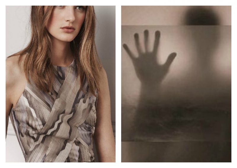
It’s pretty clear to me Sherwin-Williams looked to the current Fashion trend of soft layers and “fade away” as part of their inspiration for naming their Color of the Year for 2017.
Poised Taupe is a great color for a bathroom. It is soothing and its warmth is a good choice for making skin look healthier. In an eggshell finish it looks calm and serene but it can turn dramatic in high gloss. It pairs beautifully with Calacatta Lincoln and Silver Brown Wave Marble.
Greige wood tones have been around for a while in the kitchen so using Poised Taupe for cabinetry or backsplash tile will be an easy trend for many to utilize. Whether you are inspired by weathered timbers or earthy mushrooms, this taupe is a great neutral for an open plan home.
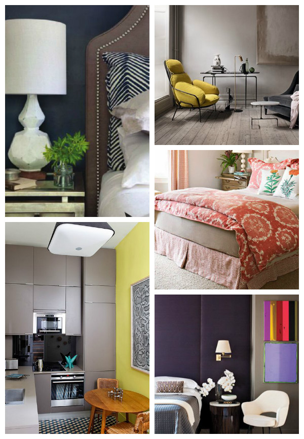
If Poised taupe is going to be the go-to neutral for 2017 it needs to work with other colors. I made the collage above to show that this cool-yet-warm color can be a versatile enough for most interiors. I think Poised Taupe looks beautiful when paired with nordic blues and golden yellows.
Speaking of Nordic Blues, check out Denim Drift, AkzoNobel’s selection for Color of the Year 2017.


