Pantone Interiors 2018 Color Palettes

It seems like I just wrapped up the new color choices for 2017 and already it’s time to  look at what PANTONE predicts will be the trending colors for Interiors in 2018.

Last year Greenery burst forth to be this year’s Color of the Year choice. According to interest on Pinterest, viewers prefer Pantone’s Fathomless palette which combines Greenery with a palette of greens and blues that evoke memories of a summer day by the water.

Often there’s a unifying color in the new palettes that Pantone releases that will be the new pick for 2018 Color of the Year. Which do you think it will be? Continue reading “Pantone Interiors 2018 Color Palettes”
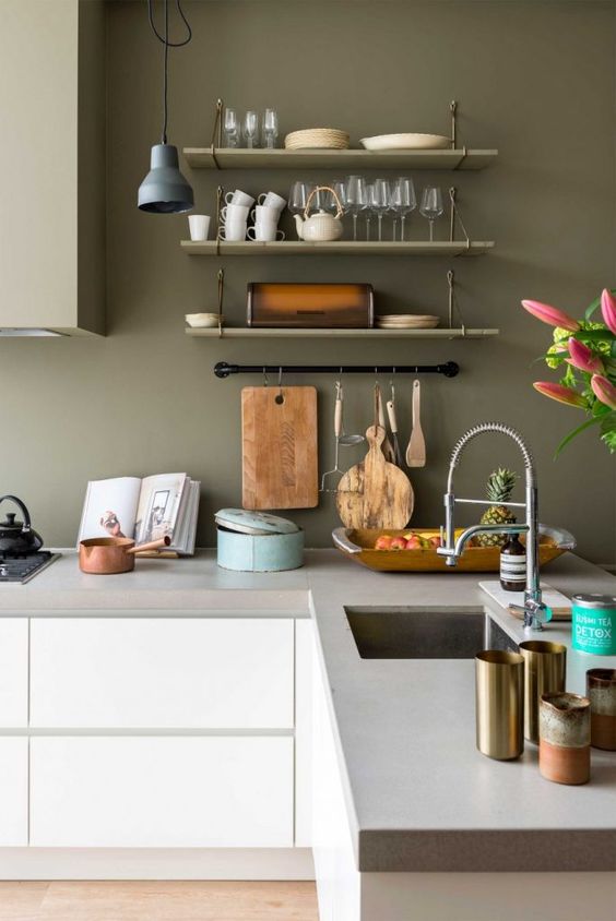
2017 North American Key Color

CMG North American Key Color 2017 | KitchAnn Style

The Color Marketing Group (CMG) has named Thrive as their Key Color for North America 2017+.

Just as PANTONE picked Greenery ( 15-0343) as their Home + Interiors Color of the Year (COTY) and Kale (18-0107) as a top Spring 2017 Fashion pick, CMG follows suit with a vegetal inspired color.

The CMG posits this yellow-influenced green will establish itself as a colorful symbol for growth, strength and endurance.

CMG North American Key Color 2017 | KitchAnn Style

Thrive  is purposely balanced between light and dark, pale and strong. Continue reading “2017 North American Key Color”

Design in 2017 Will be More Authentic

Modern dark Farmhouse | KitchAnn Style

As we look in the rear view mirror at 2016 we greet 2017 with the desire to reboot, reprioritize and seek authenticity.

PANTONE understood these needs when they selected Greenery as the Color of the Year for 2017. According to Leatrice Eiseman, executive director of the Pantone Color Institute, Greenery “symbolizes the reconnection we seek with nature, one another and a larger purpose.” Continue reading “Design in 2017 Will be More Authentic”