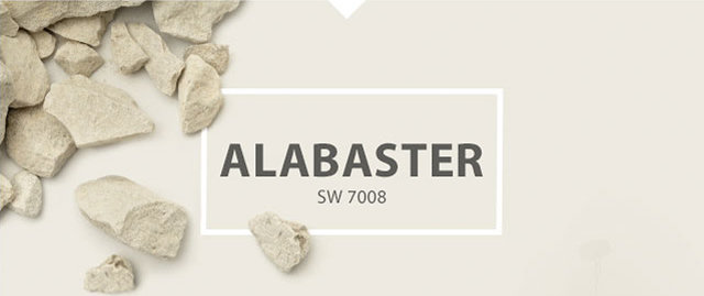
I think most of us in the design community are surprised three major paint companies selected a White as their 2016 color of the year.
Alabaster (SW 7008) is Sherwin-Williams 2016 Color of the Year, preceded by “Simply White,” picked by Benjamin-Moore, “Cappuccino White”, picked by Glidden.
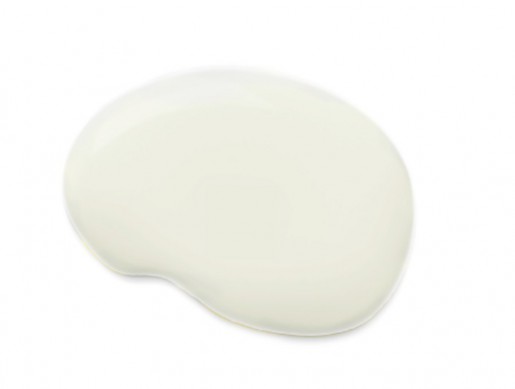
White is said to have a strong connection with pureness and light across many cultures. “At a time when homeowners are faced with excess and clutter, and may be overwhelmed by the commotion of technology, Alabaster encourages a time to relax and re-examine,” says Sherwin-William’s announcement about the color.
Alabaster is part of the Sherwin-Williams Colormix Pura Vida palette which is composed of colors reminiscent of “the elements that remind us to live well, be well, and stay well.”
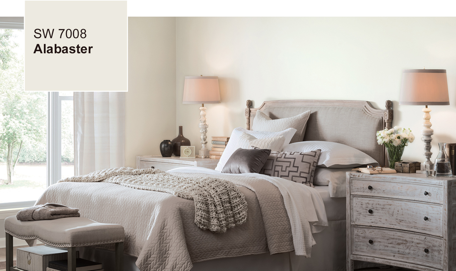
Nuanced pastels will be a dominant trend in 2016. Decorating with whites is best done in layers. Adding elements with visual texture will keep your home from looking too sterile and cold.
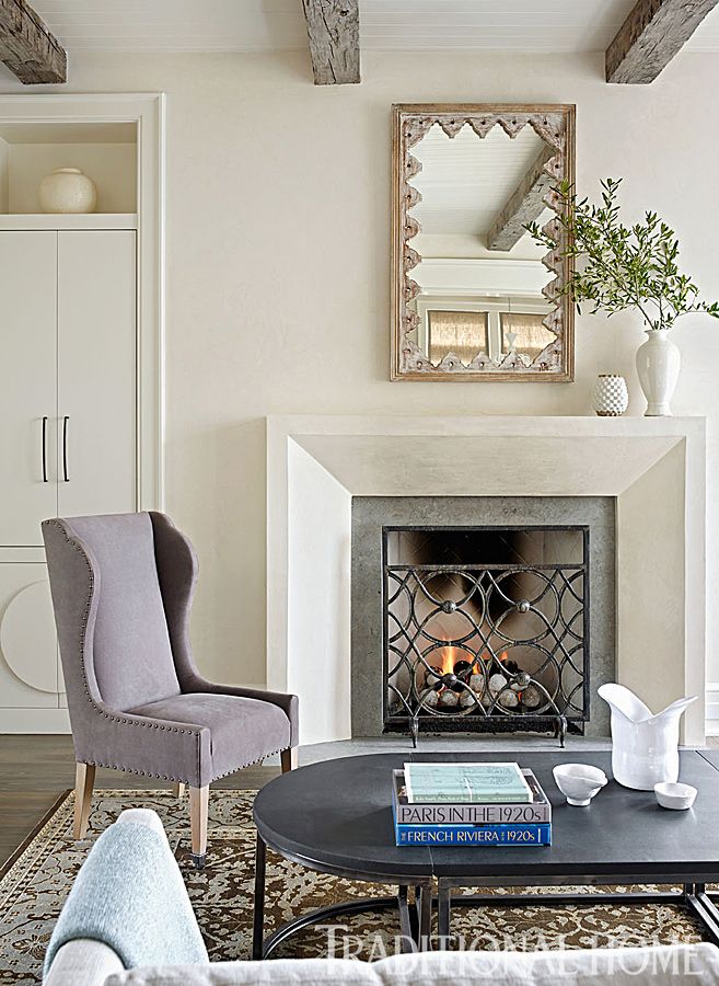
This year, we forecasted colors that provide a range of inspiration for homeowners to create spaces that surround them with the things that ignite their passions and make them feel happy and healthy.
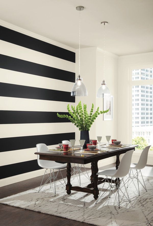
There will always be those who wish to buck the trend or who like a more graphic aesthetic. Alabaster (SW-7008) is warm enough to pair beautifully with an earthy bronze or off-black to create yin yang harmony and balance.
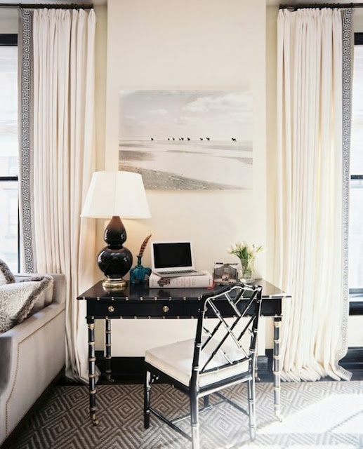
If you find yourself surrounded by “builder beige” you may find choosing a white paint a good solution for your home. As always with whites, test your paint in the room you want to use it in.

