

The 2020 Colormix Forecast from Sherwin-Williams has been name Color In Balance and contains 45 of the most on-trend colors arranged in 5 color palettes – Mantra, Heart, Alive, Play and Haven.
Sue Wadden, director of color marketing at Sherwin-Williams, and her global forecast team researched color, design, and pop culture trends across the globe for months in order to select the five themes that will welcome in a new decade in interior design.
The Trends We’re Going To Be Seeing in 2020
In case you haven’t heard, Japandi is the fusion of two of the most popular interior trends around; the functional and timeless Scandinavian look and the minimalistic elegance of Japanese style.
Also referred to as Scandinese or minimalistic zen, Japandi is the best of both worlds. Add some Bohemian and Wab-sabi flare and you have the makings of 3 of the color palettes. – Mantra, Heart, Haven.
The remaining two palettes ,Alive and Play, are more about JOMO (the joy of missing out) -the positive-minded cousin of FOMO – and being present and content with where you are at in life. We could all stand to disconnect a little and play a lot more.
Let’s explore the key elements of the 5 palettes for 2020. For reference, you can always look back at the Colormix Forecast for 2019 which had 42 colors broken down into 6 smaller palettes.
Color in Balance
Mantra – Minimalism, Serenity, Scandinese, Sanctuary

East meets West in the Mantra palette, which entwines Nordic simplicity and the order and elegance of Japanese aesthetics. With softly muted neutrals that glide from warm to cool, it embraces all that is simple yet utterly essential.

Heart – Bauhaus, Bohemian, Fusion, Tribal

Heart offers a confluence of genres from iconic modern design to intergenerational boho themes in a harmonic collection of colors. The palette includes silky earth tones as well as clove and soft coral. Sherwin-Williams describes the trend as a meditation on comfort, connection and the pleasures found in the everyday.

“We expect 2020 to be an empowering year of change that will focus on bringing your best self into the new decade,” said Sue Wadden, director of color marketing at Sherwin-Williams.
Alive – Optimism, Authenticity, Curated, Southwestern
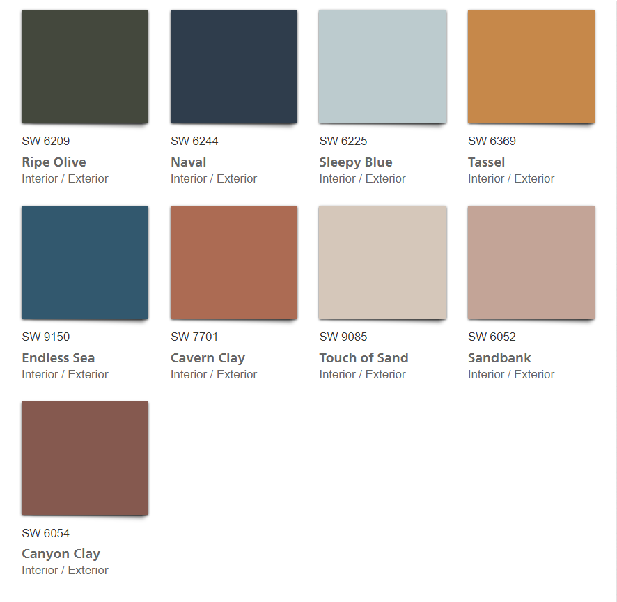
Alive marries neutrals with rich blues and deep, ripe olive to create a sense of rejuvenation. This palette is inspired by mindful living, clean eating, and relishing the moments of this amazing life. Enjoy it in an authentic space touched by materials and finishes that are locally-sourced, handmade and reflective of care and craftsmanship.

Play – Escapism, Humor, Surprise, Energy

Play, the most energetic of the palettes, features buoyant colors against pure while. This palette is about stepping back from stresses, having a good time, laughing, and bringing playfulness back into your life. Energetic and clever, this palette packs a lot of charm when paired with unique lighting and fun patterns.

This is the second time I’ve recently used a CC Tapis rug for trend inspiration. This hand-made rug company has a true understanding that the new luxury is being able to have fun and engage with others in your space.
Haven – Simplicity, Wabi-Sabi, Sanctuary, Sustainability

Haven is inspired by the Earth’s seasonal cycles and address interior space as an oasis. The palette encompasses subtle shades of seas, sand forest and sky. Key influences are material health and wabi-sabi, the Japanese aesthetic centered on the acceptance of transience and imperfection. Haven features sustainably-sourced materials and Biophilic principals.

You can explore all 45 of 2020 Colormix Forecast colors with the ColorSnap Visualizer app. The Sherwin-Williams Instant Paint augmented reality tool in the app let’s you test-drive your color of choice in your own space in real time.