When people are uncertain about the future, they will inevitably look to the past for guidance. Compared to past generations, consumer’s tastes today are more varied and no single overarching theme for homes and interiors will ever be dominant again.
In creating the forecast for 2026 and beyond, Pantone looked at past influences from the last 80 years and brought them forward with a modern more eclectic lens.
Pantone chose ‘Welcome Home’ as the theme for their forecast because it makes the forecasting tool easy to understand and welcoming. The concept of home is deeply rooted in our psyches. Color can be the the tool that transforms the home from a physical structure to a sanctuary place that shapes our identities, fosters relationships, influences our overall well-being, holds our memories and encourages our dreams.
For 2026 there are 7 palettes in the Pantone View Home + Interiors 2026 forecast. All are heavily influenced by the 2025 Pantone Color of the Year Mocha Mousse and include a remixing of different eras to suite a wide range of taste levels and aspirations.
Pantone 2026 Forecast Palettes
Out of the Ordinary — blending time-honored Scandinavian and Japanese design principles – think “Scandinese”. Simple modern elements are blended with the imperfect beauty of nature. The palette includes familiar neutral colors with a few warmer ones that are “out of the ordinary.” This palette embraces homeostasis, – the balanced undertones of warmth and coolness provide a sense of equilibrium.
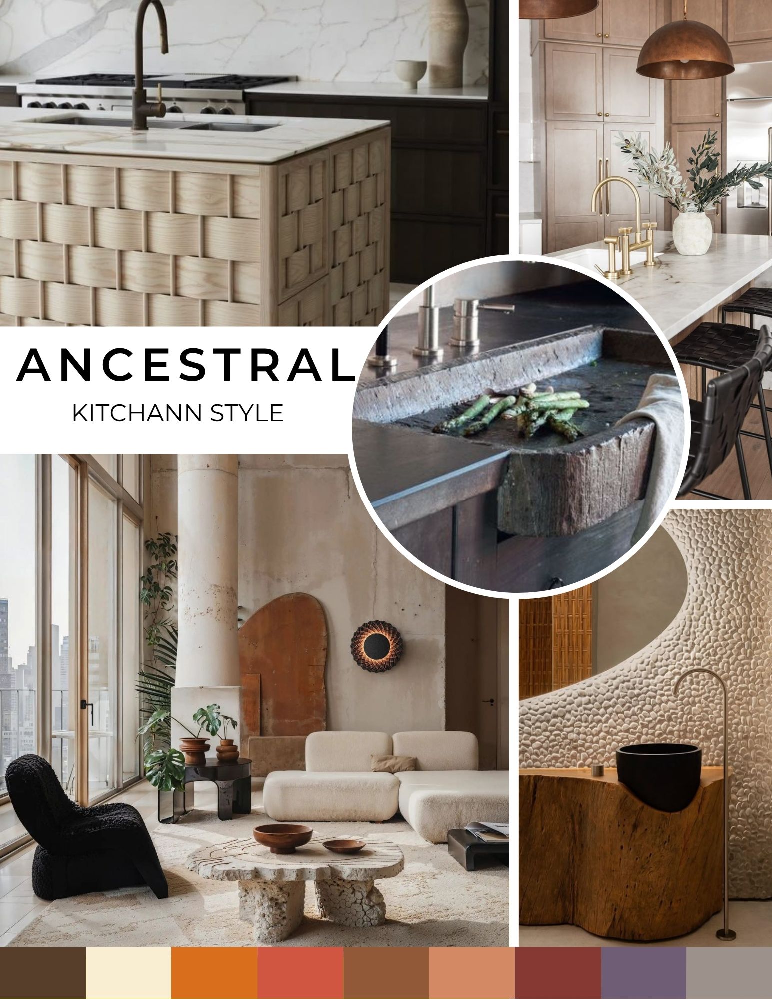
Ancestral —this palette is designed to remind people of our human heritage—think caves and early native dwellings with raw, earthy warmth. Nature’s imperfections are embraced rather than shunned. This palette largely has warm colors, with some cooler ones like a neutral grey but it is the white that adds something modern.
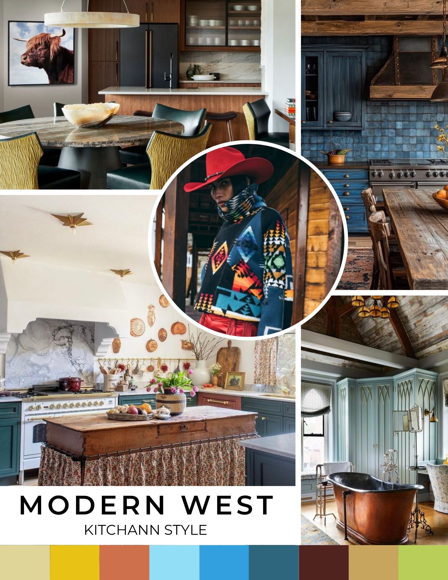
Modern West —This is where Western classic meets modern style and cowboy/cowgirl couture. Global influences from countries like Argentina, Australia and the Czech Republic include some brightness with turquoise. Browns are balanced by green – a neutral color in nature. Indigenous patterns and authentic Western embellishments also influence this palette.
Augmented — In this palette, surreal and abstract design is inspired by AI, as well as immersive and digital experiences. This vibrant combination of reds, pinks, oranges and yellows has blue and gray to balance the brightness.
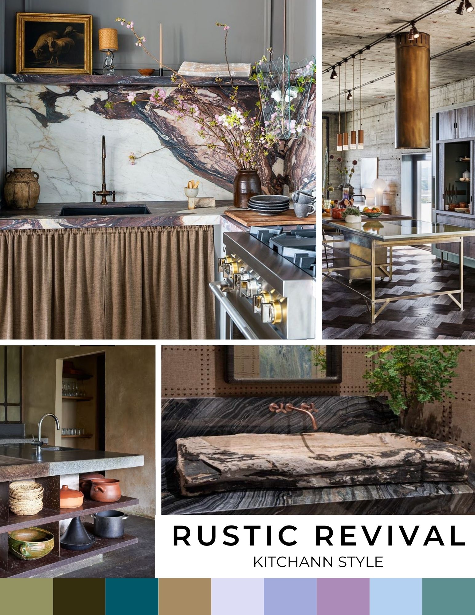
Rustic Revival —This palette is all about sustainability and industrial design with a softer, outdoor cabin feel. It’s a muted, subtle palette with sienna and gray tones representing transforming waste into functional home elements. This throwback style is subtle with a slight dirtied effect.
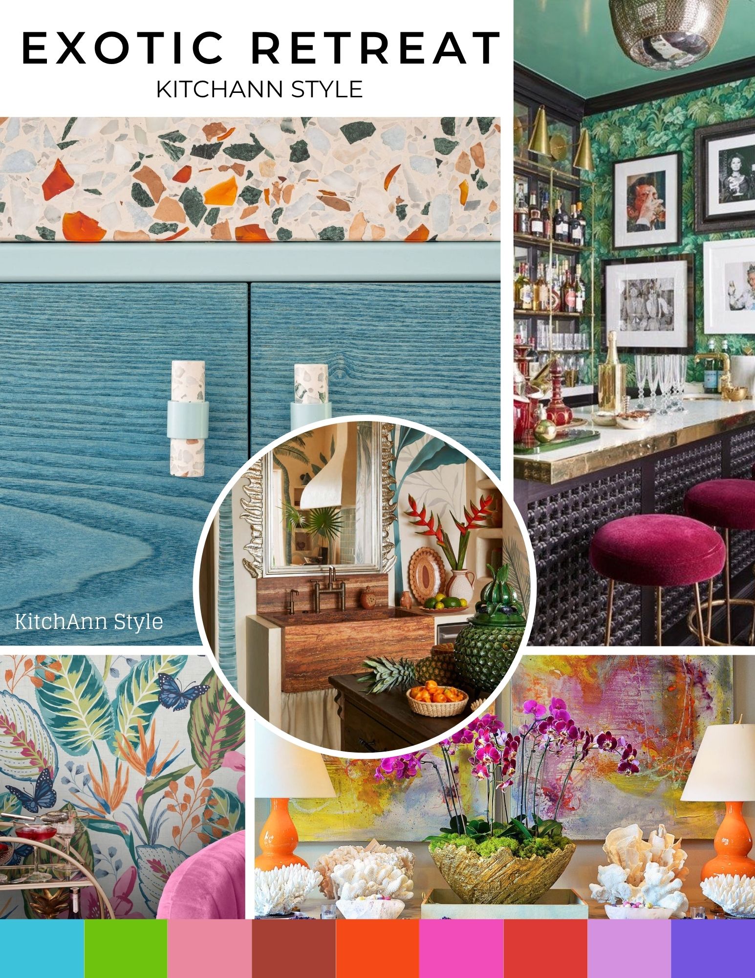
Exotic Retreat — Possibly the most fun palette, Exotic Retreat touts nature’s maximalism with vibrant colors and is a beautiful balance of cools and warms, including fuchsia, purples and browns. With tropical glamour meeting Boho paradise, Exotic Retreat helps bring vacation color and design back home with new embellishment.
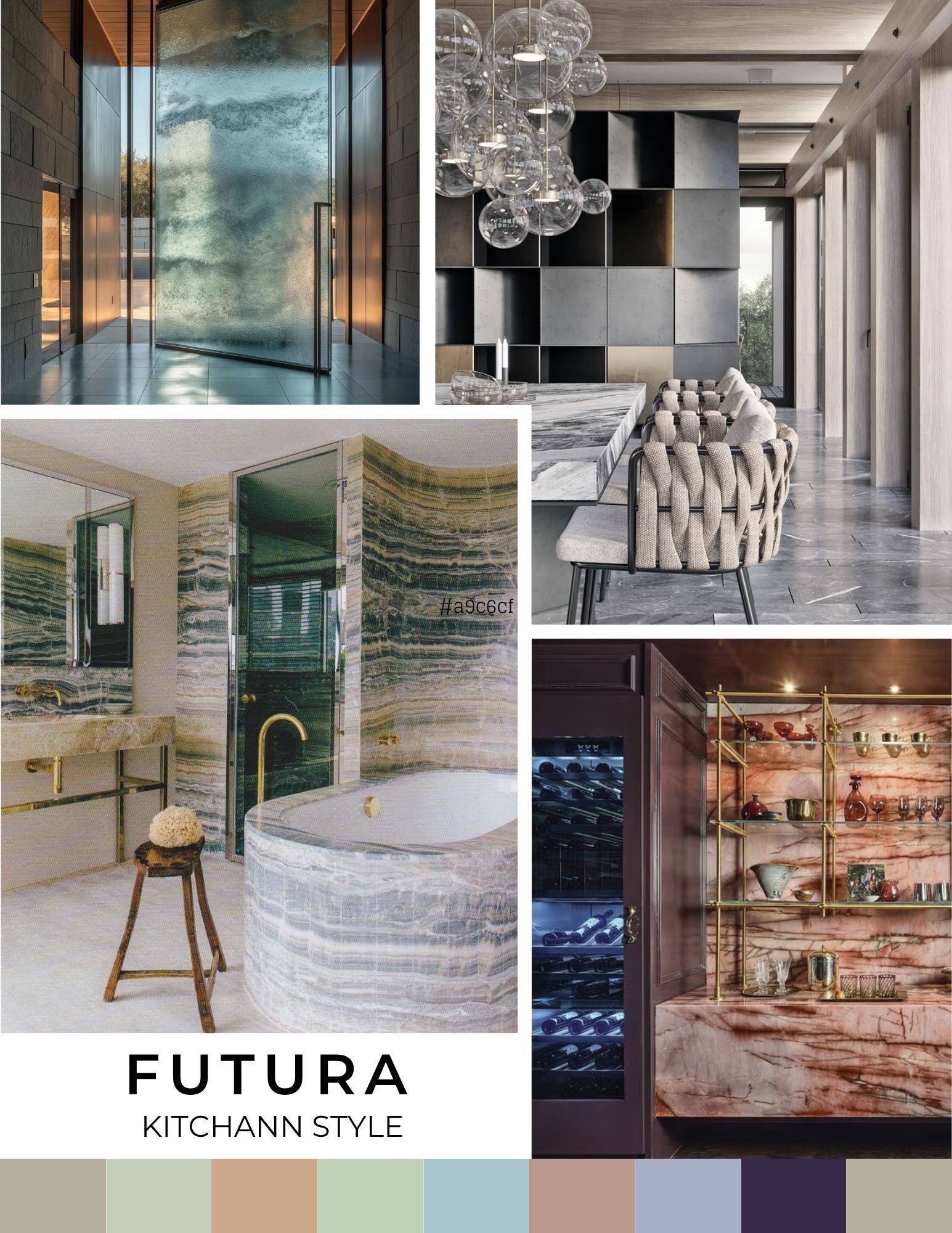
Futura — Inspired by the cosmos with celestial motifs and galactic influences, Futura is minimalist and high tech. But it’s not cool – there are nuances of color that add a bit of warmth. Futura is sophisticated and glamourous.
Whether your designing a home office or building new from the ground up, there is plenty of inspiration in the 2026 color forecast to get you started on creating your own spaces that invite comfort, nurture connection, foster play and evoke feelings of belonging.
Want more color inspiration? Check out Dunn-Edwards’ Color of the Century


