
In an era where normal isn’t normal any longer, it’s not all too shocking that a top paint brand would switch up their Color of the Year announcement to a 2021 Palette of the Year.
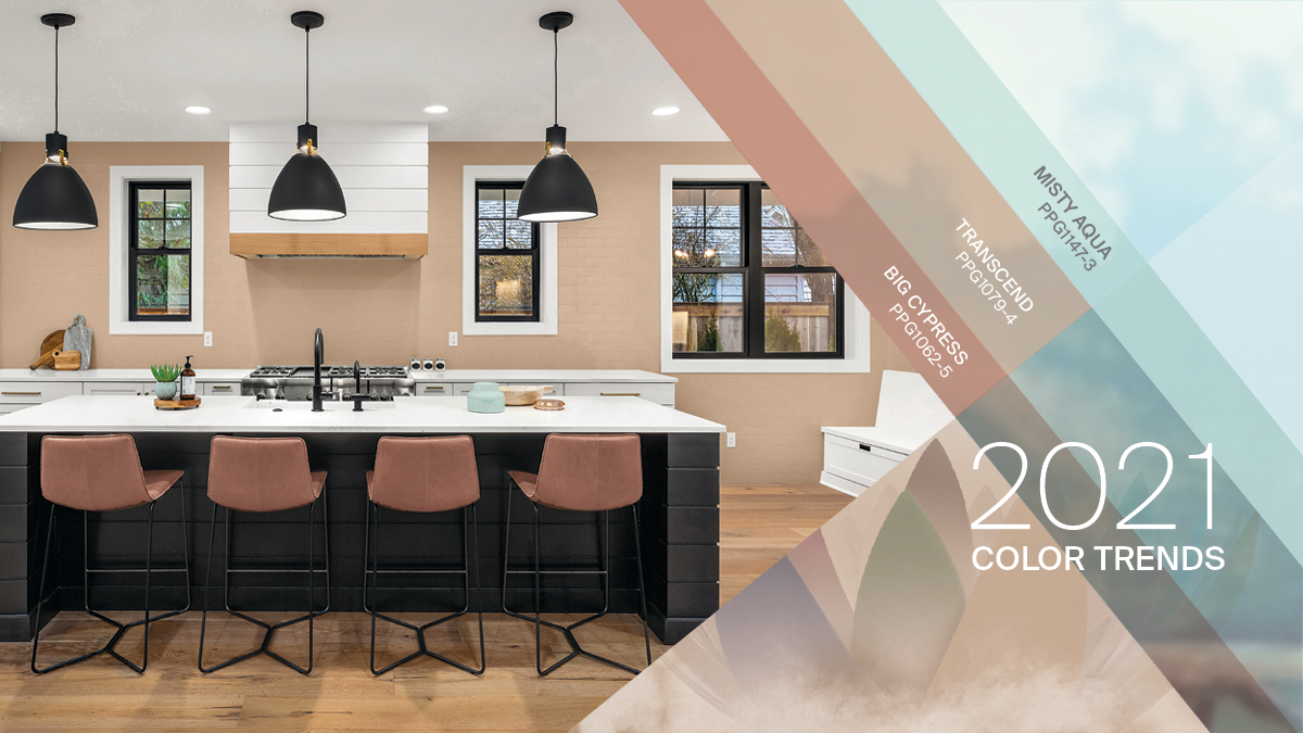
The ‘Be Well‘ palette is intended for the consumer who wants to fully embrace mindfulness and intention, showcasing natural hues that are restorative, compassionate and optimistic. Emulating both the optimism felt in nature and soothing nostalgia, the PPG 2021 Palette of the Year consists of hues Transcend, Big Cypress and Misty Aqua.
This is not a first time multiple colors have been picked for COTY – remember Pantone’s Rose Quartz and Serenity in 2016? With all of their research, Pantone was quite accurate in recognizing color preferences coinciding with societal movements toward gender equality and fluidity.

For 2021, PPG has recognized three overarching color trends – Be True, Be Well, Be Wild
- Be Well: Creating comfort This color story celebrates the beauty that comes from living with wellness as a priority. Soothing mid-tones are combined with warm neutral colors to create a sense of quiet luxury. Mix this palette with sustainable materials such as terracotta tiles and hand-hewn woods that are durable.

PPG 2021 Palette: Be Well - Be True: Anchoring reality This palette celebrates authenticity and connection by imitating an artisan’s touch and renewing traditional know-how by layering vintage-inspired colors and recycled and contemporary touches. The palette is a mixture of organic and heritage influences with warm, earthy tones combined with jewel box hues. Enchanting Eggplant, a rich maroon with chocolate undertones, grounds the palette alongside Gargoyle, a glass-bottle green, and Transcend.
PPG 2021 Palette: Be True


Be Wild: Activating optimism A mood-boosting combination of colors, these hues are a celebratory expression of individuality and reclaiming power. Included in the playful, expressive and creative palette is PPG’s Transcend, which brings an earthy element to French Lilac, an unexpected periwinkle, and Mediterranean Blue, a marine aqua-blue with a deep-water undertone.

How to Use PPG 2021 Palette of the Year
Using a tried and true decorating rule can make your color choices so easy. For the PPG 2021 Color Palette of the Year, consider the 60-30-10 rule.
The 60 percent + 30 percent + 10 percent proportion is meant to give balance to the colors used in your space. This design principle calls for 60% of a room being the dominant color, 30% (or half of the dominant color) as the secondary color, and 10% as the accent color.


I hope you are inspired by the many possible ways use the PPG 2021 Palette of the Year inside and outdoors as you create new ways to enjoy more time spent working from home and embracing time spent together.