
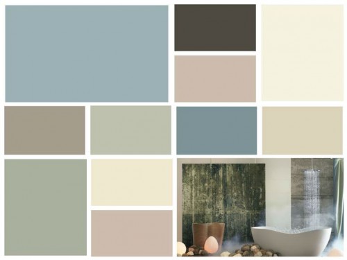
As technology rushes relentlessly ahead, the colors of Chrysalis evoke a calm oasis — a place to pause and find balance. The palette, with colors ranging from off-black to chalky neutrals and dusty blues, is designed to create a more comfortable interior.

“An important influence for Chrysalis is the appreciation of earth’s natural striations,” says Jackie Jordan – director of color marketing, Sherwin-Williams. “The patterns created by land and sky are driving design inspiration, therefore the palette’s colors are found in nature, from rocks found on the beach to a stormy sky.”
More inspiration for the Chrysalis Theme:

Neutral Bathroom with clean styling.

Dreamy Bedroom

Impressionistic Artwork

Beachy Table Setting

Kitchen with Natural Elements

Botanical Prints and Settee with Calming Paint
This is a great color palette and one I’ve been using here in Charlotte for a while. People love the soft coastal colors but have to be careful with those pink hues 🙂