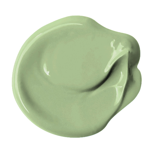
It’s time to celebrate the first Color of the Year for 2022 – a vibrant, encouraging green from PPG called Olive Sprig (PPG1125-4).
Green has a universal appeal and readiness to coexist with other hues making it a great option for a COTY choice which might be why Benjamin Moore selected Guilford Green in 2015 and Behr picked Back to Nature in 2020.
“DIYers, property managers, designers, and architects are shifting away from the stark, neutral palettes of yesterday and opting for color in all forms. Call it rebellion, but we are certainly here for the resurgence of optimistic colors to guide us into a new era of home design.” –Amy Donato, PPG’s senior color marketing manager

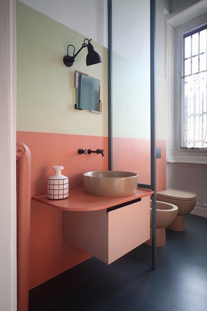
Olive Sprig is a relaxed, but enticing green that emulates the feeling of soothing aloe vera or a fragrant plant – brightening any space with organic liveliness. A versatile color that lives well inside or outside, Olive Sprig blends in with nearly any environment.

Olive Spring pairs beautifully with bronze and brass accents and with natural wood tones such as walnut.
ICYMI: PPG Color of the Year 2020: Chinese Porcelain
First Color of the Year and 3 Color Stories for 2022
In addition to Olive Sprig’s encapsulation of current trends, PPG has proffered three distinct color stories under the theme Horizon, which represents our current state of hope, reflection and new beginnings in the post-pandemic era.
that that will appeal to homeowners, designers, architects, and more in 2022.
Invaluable: Grounded, Privacy, Nostalgia
The Invaluable palette culminates a rich library of cultural references to imagine its perfect place in today’s world. Refined darks are carefully layered to create highs and lows for artistic interiors.

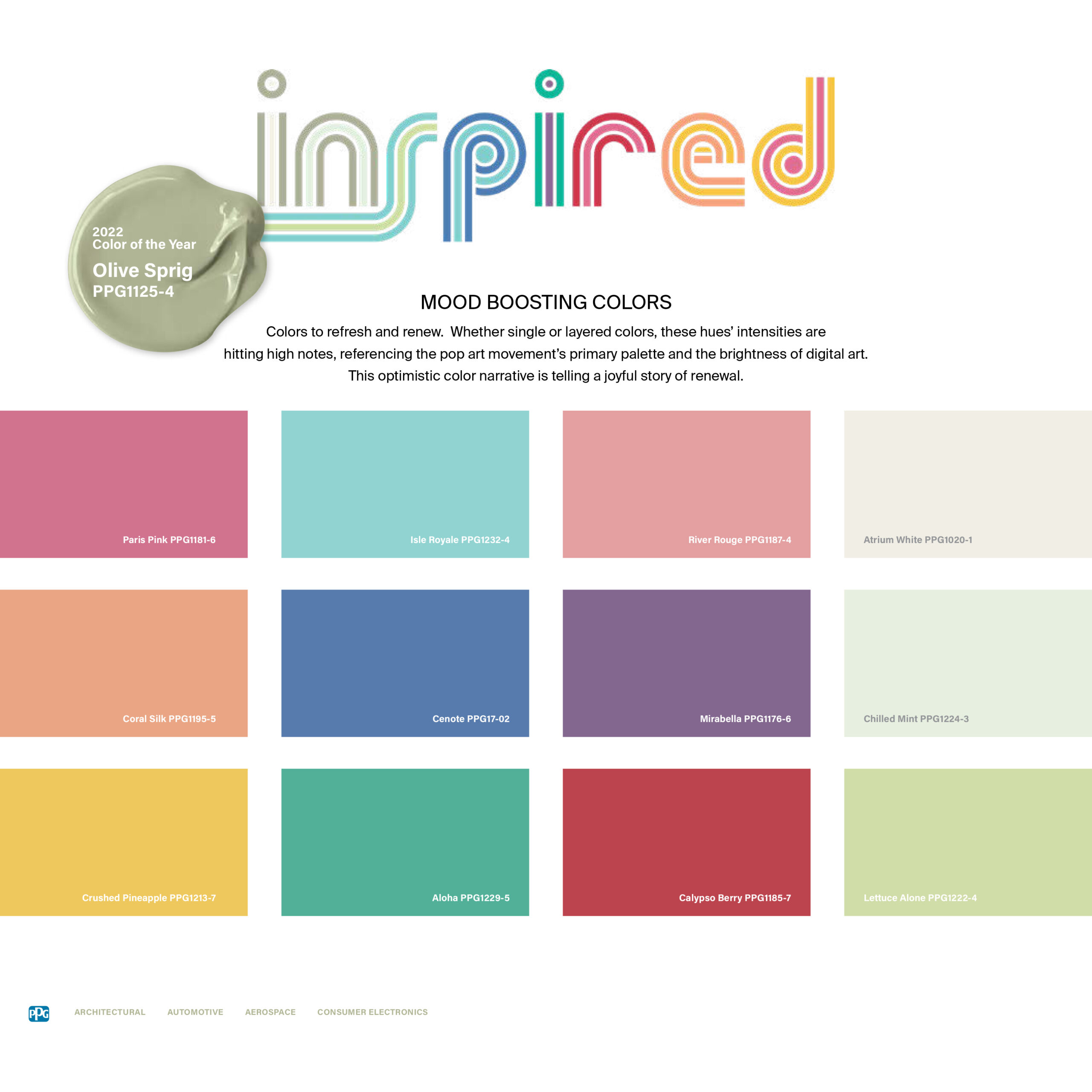
Inspired: Mood-boosting, Optimism, Individualism
Whether single or layered colors, the Inspired palette’s intensities are hitting high notes, referencing the pop art movement’s primary palette and the brightness of digital art. The inspired group is an adventurous cohort that isn’t afraid to embrace joy, play with scale, mix patterns and textures and experiment with color hacks.

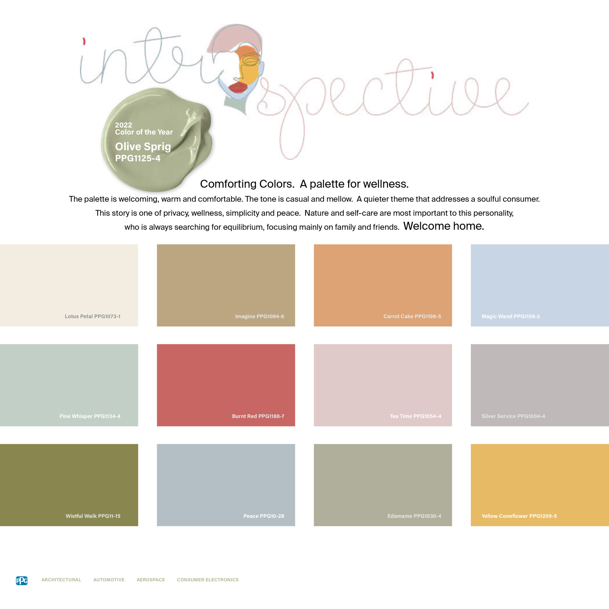
Introspective: Self-care, Escapism, Nature
The Introspective palette is ideal for someone who is searching for equilibrium and chooses to focus mainly on family and friends. Pastels and mid-tones call to mind artisans’ workshops, where materials are experimented with and pigments are explored.

It seems pretty clear this green shade ushers in the new era of warm, colorful neutrals—and further cements the decline of cool grays.


