

Nature continues to be an inspiration point for PPG who has announced Chinese Porcelain (PPG1160-6) as their 2020 Color of the Year (COTY).
As consumers tire of gray and start looking for a color to entice the senses, blue is the easiest introduction for designers to present to their clients. Chinese Porcelain is described as a “cobalt, moody ink blue”. It can be modern, timeless, approachable and calming. It is a perfect neutral, blank canvas. 
“The need for simplicity and escapism from technology is in part, the reason that consumers are craving blues like Chinese Porcelain that bring us closer to natural elements such as the sea and sky – the horizon spot, creating serenity in any space.”
I’ve discussed many Blues for Color of the Year choices over the years – Behr’s Blueprint from 2019, Graham & Brown’s Tiru from 2019 (a favorite), Sherwin-William’s Oceanside from 2018, and Akzo Nobel’s Denim Drift from 2017 (one of my all-time favorites) and I think Chinese Porcelain will be a fine addition to this group.

Blue and white porcelain pieces have been popping up everywhere as an easy solution to updating outdated Tuscan homes. Chinoiserie (pronounced Shen-wah-seh-ree) pottery, while truly global, is a staple for French Country Style decor.
2020 Global Color Trends Forecast
Chinese Porcelain, the PPG COTY 2020, is also the focal point for the broader PPG 2020 Global Color Trends Forecast with three distinct Color Stories.
On the Move:

This upbeat and playful color palette addresses consumers who are looking to remake, reuse and merge cultural influences from different eras, creating a fresh aesthetic that feels simultaneously retro and contemporary. Mismatched hues like PPG paint brand’s Brilliant Blue, Turner’s Yellow and Bleeding Heart deliver joyful color combinations that encourage self-expression from the bold and confident consumer.

At the Core:

Taking cues from Mother Nature, this color collection is earthy, botanical and sustainable, resonating with consumers who are looking for a state of balance between long lasting and purposeful living. These colors evoke comfort and nostalgia, particularly the muted mid-tones. Bright hues such as PPG paint brand’s Crushed Pineapple and Carrot Cake feel rich when contrasted with Comfort, Life Lesson, Cool Concrete and Kangaroo Paw, which double as tinted neutrals.

In the Know:
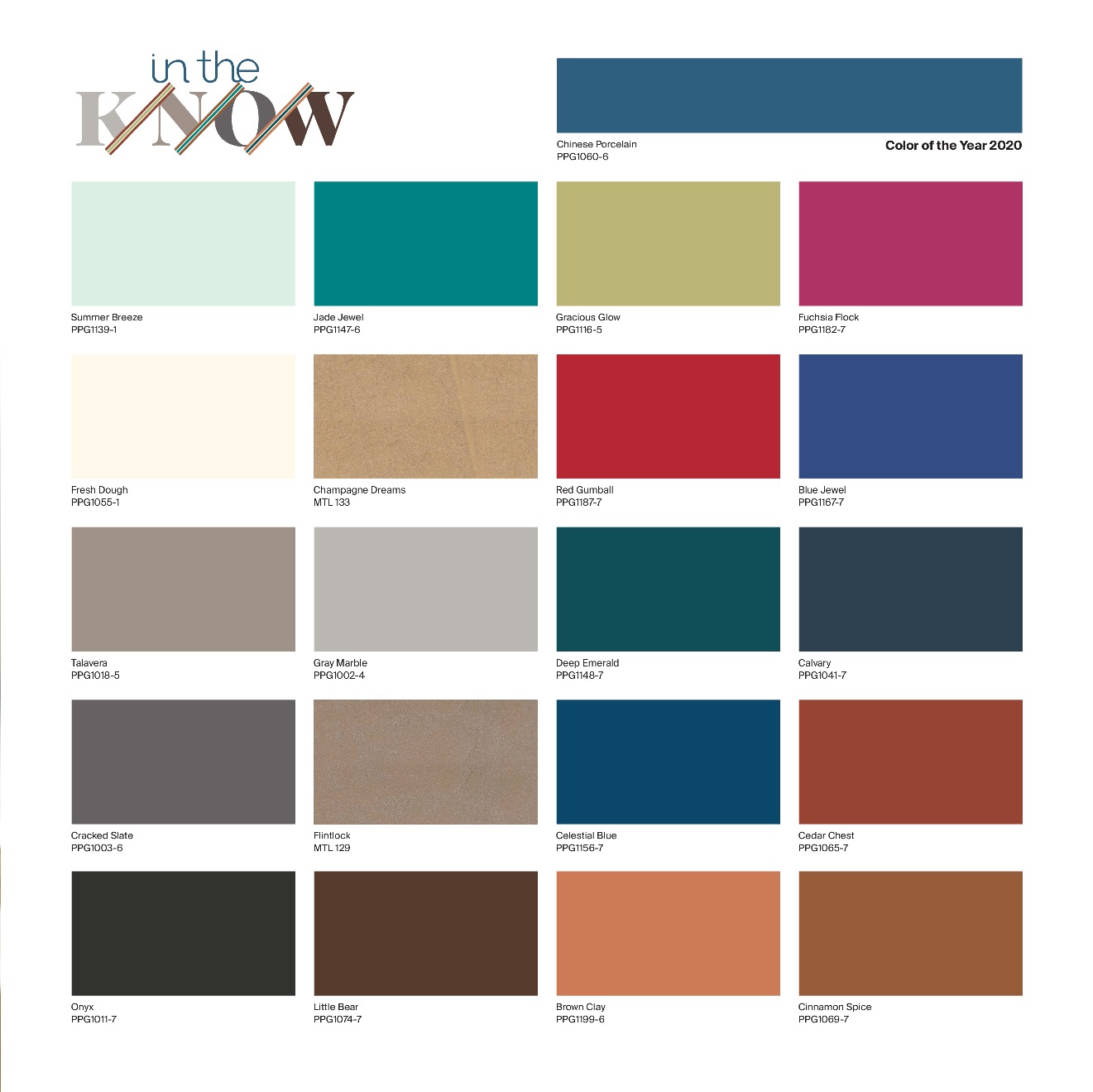
With an emphasis on knowledge, reflection and innovation, this theme represents consumers who are eager to change society while contributing to a future that is better than the past. The palette acknowledges the convergence of technology and earthliness by featuring raw, natural hues like PPG paint brand’s Cinnamon Spice and Brown Clay, as well as organic, oxidized blue-greens like Celestial Blue and Summer Breeze.

Chinese Porcelain is a rich and traditional hue that provides the perfect, agreeable backdrop for vivacious colors to pop.