
I have a love-hate relationship with trends. While I love to incorporate new looks in my own style and for my clients, this business — and it is a business — of keeping up with the times gets exhausting, and can be expensive.
While my cynical side resents feeling manipulated into wanting to buy new things, my more agreeable side is more accepting of the flow of fresh looks and innovation.
While I don’t adopt every new trend for myself, I do aim to stay educated on what is current. After all, not every trend is going to fit with my personal aesthetic – nor a potential client’s.
One trend that has caught my attention over the last several years is Color for the Home.
This past year I covered 9 Color of the Year (COTY) Choices moving forward for 2018.
Pittsburgh Paints Color of the Year 2018
Behr’s First Ever Color of the Year
Sherwin-Williams Color of the Year 2018
Dutch Boy Paints’ Color of the Year 2018
Benjamin Moore Color of the Year 2018
Graham & Brown Color of the Year 2018
AkzoNobel Color of the Year 2018
Dunn-Edwards Color of the Year 2018
Pantone Color of the Year 2018

Declaring a COTY started in the late 1990s–Pratt & Lambert, a paint manufacturer I missed this year due to color fatigue, claims their program dates to 1996. But the concept went mainstream in 1999 when Pantone declared Cerulean the color of the year millennium.
In today’s online world, marketing has shifted away from traditional newspaper and television ads toward social-media friendly campaigns. Announcing a color of the year is reported to be more about increasing a paint company’s exposure than increasing sales of one color.
Who doesn’t love a well curated Instagram page than floats from from one color to the next?
Color for Manufacturers can be a different story. If brands follow color forecasts then they’ll be part of what ultimately becomes a trend.Predicting colors is tricky – there are regional preferences. Other factors such as architectural style affect color preferences as well.
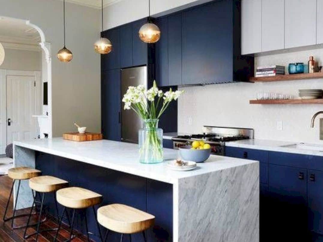
Selecting color for the home is a little different than picking out a new Pink Sunset purse by Kate Spade. For my clients whose projects may take a year or two to reach completion, we want our choices to still be relevant. More trendy colors are okay for accessories and walls since they can be easily changed out. However, color for cabinetry, fixtures and appliances needs more longevity. The client needs to love the color palette years from now.

The world of color is evolving as quickly as the trends that try to keep up. 2018 looks to be no different as designers combine and mix materials to create atmospheres that look and feel like success.